Hello World! In this post, we’re going to go more in-depth into some of the most basic UI controls that iOS supports. We’ll be covering a large number of different UI controls like text fields, buttons, switches, steppers, and sliders. These are the fundamental building blocks of any iOS app so we’ll start our journey here. We’ll also learn what delegates are in the context of these UI controls, since we’ll need them to perform some specific actions.
Let’s create a new Xcode project that’s a Single View Application. Call it BasicControls and give it an identifier and name. Make sure that the language is Swift and the device is iPhone. You can uncheck the boxes for “Include Unit Tests” and “Include UI Tests” since we won’t be doing anything with those for this post. Finally, save the project somewhere on your computer. Open up the main storyboard and make sure the assistant editor is visible (for when we do outlets and actions). Let’s get started!
Table of contents
Learn iOS by building real apps
Check out The Complete iOS Development Course – Build 14 Apps with Swift 2 on Zenva Academy to learn Swift 2 and iOS development from the ground-up with an expert trainer.
Did you come across any errors in this tutorial? Please let us know by completing this form and we’ll look into it!

FINAL DAYS: Unlock coding courses in Unity, Godot, Unreal, Python and more.
Buttons
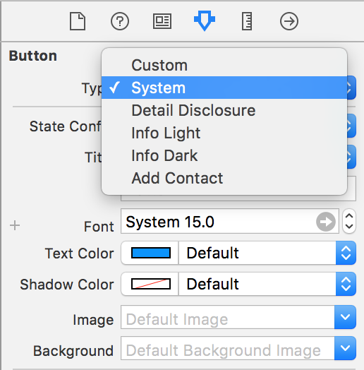
The most basic of all UI controls is the humble button. Drag out a UIButton somewhere on the screen, and we’ll go over the various features UIButtons can have. First of all, UIButtons can have different types. The default is the System type. We can see all of the types in the “Type” field of the attributes inspector.
In addition to the System type, we can also have buttons that are info light/dark, detail disclosure, and add contact. These types come with the icons already set. Note that if we choose to use any of the non-system styles, we cannot customize the icons. Part of the reason for this is to enforce a continuous user experience. It can be very jarring for the user if they have to guess what a particular icon does. Instead of guessing, iOS enforces a set of icons so that when users see a button with an “i” in it, they immediately know that it means “more information.” Confused users are not happy users!
However, there is a custom style so we can add our own flavor to our app. Just make sure not to confuse your users! In the attributes inspector, there are a slew of different properties that we can have for UIButtons, like font, font size, text color, shadow color, background color, and more. There is also a field to choose the state of a button UIButton’s have four states: default, highlighted, selected, and disabled. Usually, we won’t have to handle the highlighted or selected cases, since they’re handled by the system, but the disabled case might be useful to use. For example, suppose we were building an app that had a login page. It would make sense to disable the login button until we’ve registered that the user has entered both a username and password. It’s even more useful if we can do this in code:
myButton.enabled = false
In the above code snippet, we assume that we have an outlet to the UIButton, and we can simply set the enabled property to be false to disable and true to enable the UIButton.
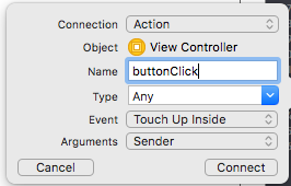
We can create actions for when the UIButton is pressed by control-dragging from the button to the Swift file and selecting action in the popup. From there, the action is wired, and we can simply program the action.
That’s all there is to talk about the humble button! We saw how to change the type of button as well as the different button states, like enabled/disabled. We also saw how to register actions using buttons.
Text Fields
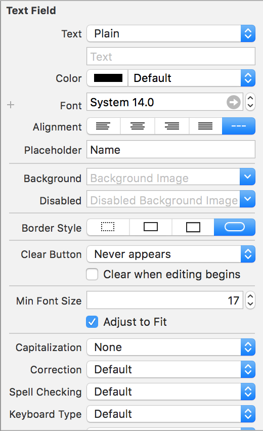
The simplest user-entry control is the UITextField. It allows the user to enter text, and we can access that text programmatically as a property to manipulate it. UITextFields are usually empty, so they have a helpful property called the Placeholder that puts semi-transparent text in the UITextField that disappears when the user presses on it. It is meant to tell the user what data should go in that field.
Under the placeholder field, we can have different border styles for styles for the UITextField. The default is the rounded rect that we see, but we could also have a bezel border, a lined border, or no border at all.
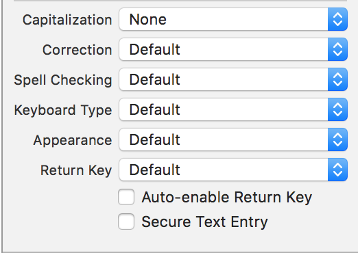
If we scroll down some, we can see the most useful properties of the UIEditText. We can choose a capitalization scheme (none, words, sentences, or all caps). We can choose to enable any auto-correct or spell checking for this particular UITextField. One of the most useful properties is the Keyboard type. With it, we can change the keyboard based on what kind of data we want the user to enter. For example, if our UITextField was meant to hold a price, we can have the keyboard type be decimal pad to force the user to enter only decimal numbers. The appearance changes the theme and the return key dictates what kind of key is at the very bottom right of the keyboard (i.e. Search, Go, Google, Return, etc.)
One issue with UITextFields is that when we press the return key, the keyboard doesn’t dismiss! We can fix that by using delegates. Delegation is a design pattern used heavily in iOS programming. With delegation, we designate a view controller to be a delegate for a particular UI element or other class. Then we can execute code when certain events occur. Let’s take our UITextField as an example. First create, an outlet for it.
class ViewController: UIViewController, UITextFieldDelegate {

    @IBOutlet weak var textField: UITextField!
    override func viewDidLoad() {
        super.viewDidLoad()
        // Do any additional setup after loading the view, typically from a nib.
        textField.delegate = self
    }

    ...


}
We usually assign delegates in the viewDidLoad() function so that the UI is all configured, and we don’t have to worry about nil outlets. We set the delegate of the UITextField to be the current view controller. Because we do this, we also need to say that this class implements the UITextFieldDelegate protocol. A protocol is simply a list of optional or required functions that occur when events are triggered. In our case, we want to dismiss the keyboard when the return key is pressed. We need to implement an optional function specified in the protocol called textFieldShouldReturn(…).
func textFieldShouldReturn(_ textField: UITextField) -> Bool {
    textField.resignFirstResponder()
    return true
}
This function is called whenever the return key, whatever text it may have, is pressed. The resignFirstResponder() method on the UITextField will dismiss the keyboard. When we run our app, the keyboard will dismiss when the return key is pressed!
That’s all there is with text fields! We saw all of the different properties we can apply to UITextField, particularly the keyboard type property that can change which type of keyboard comes up when the user taps on the UITextField (i.e. decimal, email, etc.). We also learned how to use delegation to allow our view controller to listen in on events from other views.
Switches, Steppers, Sliders
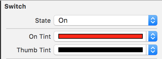
For this last of the basic UI, we’ll cover switches, steppers, and sliders. Switches are a very basic control and are used to either choose between two mutually exclusive options or toggle a field on or off. They have a state, either on or off. We can customize their look by adding an image for each state or change the colors of the UISwitch.
To change the state of the switch programmatically, we can use the on property.
mySwitch.on = false
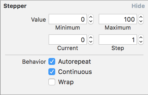
Steppers allow users to make precise adjustments to a discrete data field. Usually, we use them in conjunction with another view, where changing the stepper value has an effect on another view. We can change various properties of the UIStepper, like set the bounds, as well as the current value and step size.
If we wanted to retrieve the current value of the UIStepper to alter other views, we can use the value property.
var stepperValue = myStepper.value
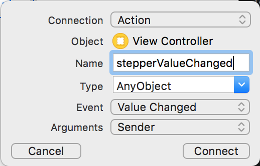
In addition, we can set up an action for when the UIStepper’s value changes so we can make the corresponding changes in other views.
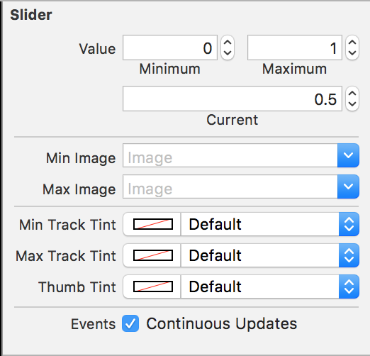
As steppers are used to make adjustments over discrete ranges, sliders are used to make adjustments over continuous ranges. Similar to steppers, we can change the minimum and maximum range and the current value. Usually with UISliders, we have a max and min image, like brightness or volume, so the user knows what they are adjusting.
Similar to steppers, we can retrieve the current value of the slider using the value property.
var sliderValue = mySlider.value
We can also set up the same Value Changed action to be notified whenever the value of the UISlider changes.
That’s all for switches, steppers, and sliders! Each have their own purpose and are as fundamental as buttons and text fields. They have some degree of customization so they can be themed using your app’s color scheme. To recap, switches are used for a mutually exclusive selection; steppers are used for discrete values; sliders are used for continuous values.
Conclusion
In this post, we covered some of the most fundamental iOS UI controls. We started with the button, then moved on to the text field. Finally, we concluded with a trio of switches, steppers, and sliders. In addition to learning about these UI controls, we also discussed the important pattern of delegation, used throughout iOS. We can make our view controller the delegate for other UI controls so we can respond to changes or events.
