Dimensionality Reduction is a powerful technique that is widely used in data analytics and data science to help visualize data, select good features, and to train models efficiently. We use dimensionality reduction to take higher-dimensional data and represent it in a lower dimension. We’ll discuss some of the most popular types of dimensionality reduction, such as principal components analysis, linear discriminant analysis, and t-distributed stochastic neighbor embedding. We’ll use these techniques to project the MNIST handwritten digits dataset of images into 2D and compare the resulting visualizations.
Download the full code here.
Did you come across any errors in this tutorial? Please let us know by completing this form and we’ll look into it!

FINAL DAYS: Unlock coding courses in Unity, Godot, Unreal, Python and more.
Table of contents
Handwritten Digits: The MNIST Dataset
Before discussing the motivation behind dimensionality reduction, let’s take a look at the MNIST dataset. We’ll be using it as a running example.

The MNIST handwritten digits dataset consists of binary images of a single handwritten digit (0-9) of size  . The provided training set has 60,000 images, and the testing set has 10,000 images.
We can think of each digit as a point in a higher-dimensional space. If we take an image from this dataset and rasterize it into a  vector, then it becomes a point in 784-dimensional space. That’s impossible to visualize in that higher space!
These kinds of higher dimensions are quite common in data science. Each dimension represents a feature. For example, suppose we wanted to build a naive dog breed classifier. Our features may be something like height, weight, length, fur color, and so on. Each one of these becomes a dimension in the vector that represents a single dog. That vector is then a point in a higher-dimensional space, just like our MNIST dataset!
Dimensionality Reduction
Dimensionality reduction is a type of learning where we want to take higher-dimensional data, like images, and represent them in a lower-dimensional space. Let’s use the following data as an example.

(These plots show the same data, except the bottom chart zero-centers it.)
With these data, we can use a dimensionality reduction to reduce them from a 2D plane to a 1D line. If we had 3D data, we could reduce them down to a 2D plane, and then to a 1D line.
Most dimensionality reduction techniques aim to find some hyperplane, which is just a higher-dimensional version of a line, to project the points onto. We can imagine a projection as taking a flashlight perpendicular to the hyperplane we’re projecting onto and plotting where the shadows fall on that hyperplane. For example, in our above data, if we wanted to project our points onto the x-axis, then we pretend each point is a ball and our flashlight would point directly down or up (perpendicular to the x-axis) and the shadows of the points would fall on the x-axis. This is what we call a projection. We won’t worry about the exact math behind this since scikit-learn can apply this projection for us.
In our simple 2D case, we want to find a line to project our points onto. After we project the points, then we have data in 1D instead of 2D! Similarly, if we had 3D data, we would want to find a plane to project the points down onto to reduce the dimensionality of our data from 3D to 2D. The different types of dimensionality reduction are all about figuring out which of these hyperplanes to select: there are an infinite number of them!
Principal Component Analysis
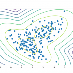
One technique of dimensionality reduction is called principal component analysis (PCA). The idea behind PCA is that we want to select the hyperplane such that, when all the points are projected onto it, they are maximally spread out. In other words, we want the axis of maximal variance! Let’s consider our example plot above. A potential axis is the x-axis or y-axis, but, in both cases, that’s not the best axis. However, if we pick a line that has the same diagonal orientation as our data, that is the axis where the data would be most spread!

The longer blue axis is the correct axis! (The shorter blue axis is for visualization only and is perpendicular to the longer one.) If we were to project our points onto this axis, they would be maximally spread! But how do we figure out this axis? We can use a linear algebra concept called eigenvectors! Essentially, we compute the covariance matrix of our data and consider that covariance matrix’s largest eigenvectors. Those are our principal axes and the axes that we project our data onto to reduce dimensions.
Using this approach, we can take high-dimensional data and reduce it down to a lower dimension by selecting the largest eigenvectors of the covariance matrix and projecting onto those eigenvectors.
Linear Discriminant Analysis
Another type of dimensionality reduction technique is called linear discriminant analysis (LDA). Similar to PCA, we want to find the best hyperplane and project our data onto it. However, there is one big distinction: LDA is supervised! With PCA, we were using eigenvectors from our data to figure out the axis of maximum variance. However, with LDA, we want the axis of maximum class separation! In other words, we want the axis that separates the classes with the maximum margin of separation.
The following figure shows the difference between PCA and LDA.

(Source: https://algorithmsdatascience.quora.com/PCA-4-LDA-Linear-Discriminant-Analysis)
With LDA, we choose the axis so that Class 1 and Class 2 are maximally separated, i.e., the distance between their means is maximal. We must have class labels for LDA because we need to compute the mean of each class to figure out the optimal plane.
It’s important to note that LDA does make some assumptions about our data. In particular, it assumes that the data for our classes are normally distributed (Gaussian distribution). We can still use LDA on data that isn’t normally distributed, but we may not find an optimal hyperplane. Another assumption is that the covariances of each class are the same. In reality, this also might not be the case, but LDA will still work fairly well. We should keep these assumptions in mind when using LDA on any set of data.
t-Distributed Stochastic Neighbor Embedding (t-SNE)
A more recent dimensionality reduction technique that’s been widely adopted is t-Distributed Stochastic Neighbor Embedding (t-SNE) by Laurens Van Der Maaten (2008). t-SNE fundamentally differs from PCA and LDA because it is probabilistic! Both PCA and LDA are deterministic, but t-SNE is stochastic, or probabilistic.
At a high level, t-SNE aims to minimize the divergence between two distributions: the pairwise similarity of the points in the higher-dimensional space and the pairwise similarity of the points in the lower-dimensional space.
To measure similarity, we use the Student’s t-distribution or Cauchy Distribution! This is a distribution that looks very similar to a Gaussian, but it is not the Gaussian distribution! To compute the similarity between two points  and
and  , we use probabilities:
![\[ p_{j|i} = \displaystyle\frac{\exp(-||x_i-x_j||^2/2\sigma_i^2)}{\sum_{k=1}^N \exp(-||x_i-x_k||^2/2\sigma_i^2)} \]](https://gamedevacademy.org/wp-content/ql-cache/quicklatex.com-a717798fc3febb07989fd75221b41a76_l3.png "Rendered by QuickLaTeX.com")
where N is the number of data points and  . In other words, this equation is telling us the likelihood that would choose as its neighbor. Notice the t-distribution is centered around . Intuitively, the farther is from , the smaller the probability becomes.
Similarly, we can compute the same quantity for the points in the lower-dimensional space.
![\[ q_{j|i} = \displaystyle\frac{\exp(-||y_i-y_j||^2/2\sigma_i^2)}{\sum_{k=1}^N \exp(-||y_i-y_k||^2/2\sigma_i^2)} \]](https://gamedevacademy.org/wp-content/ql-cache/quicklatex.com-2b3426fe088b320bab97e5bf103c5157_l3.png "Rendered by QuickLaTeX.com")
Now how do we measure the divergence between two distributions? We simply use the Kullback-Leibler divergence (KLD).
![\[ C = \sum_i KL(P_i || Q_i) = \sum_i\sum_j p_{j|i} \log \displaystyle\frac{p_{j|i}}{q_{j|i}} \]](https://gamedevacademy.org/wp-content/ql-cache/quicklatex.com-e87d16f8c601649e19eea5d517422f92_l3.png "Rendered by QuickLaTeX.com")
This is our cost function! Now we can use a technique like gradient descent to train our model.
There’s just one last thing to figure out:  . We can’t use the same
  for all points! Denser regions should have a smaller , and sparser regions should have a larger . We solidify this intuition into a mathematical term called perplexity. Think of it as a measure of the effective number of neighbors, similar to the
  of k-nearest neighbors.

t-SNE performs a binary search for the that produces a distribution  with the perplexity specified by the user: perplexity is a hyperparameter. Values between 5 and 50 tend to work the best.
In practice, t-SNE is very resource-intensive so we usually use another dimensionality reduction technique, like PCA, to reduce the input space into a smaller dimensionality (like maybe 50 dimensions), and then use t-SNE.
t-SNE, as we’ll see, produces the best results out of all of the dimensionality reduction techniques because of the KLD cost function.
Dimensionality Reduction Visualizations
Now that we’ve discussed a few popular dimensionality reduction techniques, let’s apply them to our MNIST dataset and project our digits onto a 2D plane.
First, we need to import numpy, matplotlib, and scikit-learn and get the MNIST data. Scikit-learn already comes with the MNIST data (or will automatically download it for you) so we don’t have to deal with uncompressing it ourselves! Additionally, I’ve provided a function that will produce a nice visualization of our data.
import numpy as np
import matplotlib.pyplot as plt
from matplotlib import offsetbox
from sklearn import manifold, datasets, decomposition, discriminant_analysis

digits = datasets.load_digits()
X = digits.data
y = digits.target
n_samples, n_features = X.shape

def embedding_plot(X, title):
    x_min, x_max = np.min(X, axis=0), np.max(X, axis=0)
    X = (X - x_min) / (x_max - x_min)

    plt.figure()
    ax = plt.subplot(aspect='equal')
    sc = ax.scatter(X[:,0], X[:,1], lw=0, s=40, c=y/10.)

    shown_images = np.array([[1., 1.]])
    for i in range(X.shape[0]):
        if np.min(np.sum((X[i] - shown_images) ** 2, axis=1)) < 1e-2: continue
        shown_images = np.r_[shown_images, [X[i]]]
        ax.add_artist(offsetbox.AnnotationBbox(offsetbox.OffsetImage(digits.images[i], cmap=plt.cm.gray_r), X[i]))

    plt.xticks([]), plt.yticks([])
    plt.title(title)
Using any of the dimensionality reduction techniques that we’ve discussed in scikit-learn is trivial! We can get PCA working in just a few lines of code!
X_pca = decomposition.PCA(n_components=2).fit_transform(X)
embedding_plot(X_pca, "PCA")
plt.show()
Below is the resulting plot.

After taking a closer look at this plot, we notice something spectacular: similar digits are grouped together! If we think about it, this result makes sense. If the digits looked similar, when we rasterized them into a vector, the points must have been relatively close to each other. So when we project them down to the lower-dimensional space, we also expect them to be somewhat close together as well. However, PCA doesn’t know anything about the class labels: it’s going off of just the axis of maximal variance. Maybe LDA will work better since we can separate the classes in the lower-dimensional space better.
Now let’s use LDA to visualize the same data. Just like PCA, using LDA in scikit-learn is very easy! Notice that we have to also give the class labels since LDA is supervised!
X_lda = discriminant_analysis.LinearDiscriminantAnalysis(n_components=2).fit_transform(X, y)
embedding_plot(X_lda, "LDA")

plt.show()
Below is the resulting plot from LDA.

This looks slightly better! We notice that the clusters are a bit farther apart. Consider the 0’s: they’re almost entirely separated from the rest! We also have clusters of 4’s at the top left, 2’s and 3’s at the right, and 6’s in the center. This is doing a better job at separating the digits in the lower-dimensional space. We can attribute this improvement to having information about the classes: remember that LDA is supervised! By knowing the correct labels, we can choose hyperplanes that better separate the classes. Let’s see how t-SNE compares to LDA.
(We may get a warning about collinear points. The reason for the warning is because we have to take a matrix inverse. Don’t worry too much about it since we’re just using this for visualization.)
Finally, let’s use t-SNE to visualize the MNIST data. We’re initializing the embedding to use PCA (in accordance with Laurens Van Der Maaten’s recommendations). Unlike LDA, t-SNE is completely unsupervised.
tsne = manifold.TSNE(n_components=2, init='pca').fit_transform(X)
embedding_plot(X_tsne,"t-SNE")

plt.show()
Below is the plot from t-SNE.

This looks the best out of all three! There are distinct clusters of points! Notice that almost all of the digits are separated into their own clusters. This is a direct result of minimizing the divergence of the two distributions: points that are close to each other in the high-dimensional space will be close together in the lower-dimensional space!
To summarize, we discussed the problem of dimensionality reduction, which is to reduce high-dimensional data into a lower dimensionality. In particular, we discussed Principal Components Analysis (PCA), Linear Discriminant Analysis (LDA), and t-Distributed Stochastic Neighbor Embedding. PCA tries to find the hyperplane of maximum variance: when the points are projected onto the optimal hyperplane, they have maximum variance. LDA finds the axis of largest class separation: when the points are projected onto the optimal hyperplane, the means of the classes are maximally apart. Remember that LDA is supervised and requires class labels! Finally, we discussed an advanced technique called t-SNE, which actually performs optimization across two distributions to produce an lower-dimensional embedding so that the points in the lower dimensionality are pairwise representative of how they appear in the higher dimensionality.
Dimensionality reduction is an invaluable tool in the toolbox of a data scientist and has applications in feature selection, face recognition, and data visualization.