React.js is a fantastic user interface primarily library because the user’s view updates automatically when a state changes. This ability to show changes to the user quickly also makes it a good fit for user-facing form errors. React allows you to easily display errors as the form is being filled so the user doesn’t have to fill in the entire form, press the submit button, then try to figure out what they got wrong.
This does not mean React can be used to make a form secure. Hackers can bypass your React form altogether, passing variables directly to the server. You will still have to provide security and additional error-handling on the server-side. Using React for error-checking is mainly for making a form easier to use.
We are going to create a simple donation form in our example. The code shows a few places where additional functionality can be added, but we are only going to focus on error-checking in this tutorial.
Did you come across any errors in this tutorial? Please let us know by completing this form and we’ll look into it!

FINAL DAYS: Unlock coding courses in Unity, Godot, Unreal, Python and more.
Download the source code
You may download all the files associated with this tutorial from here.
Learn React online
If you are keen to learn React from the ground-up feel free to check Learn and Understand React JS on Zenva Academy which covers all the basics + lots of bonus topics like React Router and Flux. If you just need a refresher on props and states, though, you can also check out this free resource before diving in!
Tutorial requirements
- You must have beginner’s knowledge of React.js, and at least a beginner’s knowledge of JavaScript. If you need to know the basics, check out my previous React tutorial.
- You will need to download the React library in order to use React on a server and go beyond the testing phase. We show you how to get around this during testing.
- You will need to download a text editor of some sort. Notepad++ is popular on Windows, and TextMate is popular on Mac machines. An editor that highlights code is preferable.
- In order to use React as part of a full website, it will need to be incorporated into a larger application. When testing the basic code with external data files, you will need to use a local or remote web server in order to get the page to work. MAMP is a good one for the Mac, and WAMP is most the most common server used on Windows machines. For a complete solution, a Node.js server is one of the most popular servers to use with React. The React library download page (above) also includes a server and other options.
Getting started with the tutorial
There are all sorts of download options for React, but we’re just going to use React from a CDN. React is available from more than one CDN, but here are the most popular links:
<!-- The core React library -->
<script src="https://fb.me/react-0.14.1.js"></script>
<!-- The ReactDOM Library -->
<script src="https://fb.me/react-dom-0.14.1.js"></script>
We are going to add a couple more JavaScript files to our index.html file:
<!DOCTYPE html>
<html>
  <head>
    <title>Learn <a class="wpil_keyword_link" href="https://gamedevacademy.org/how-to-learn-coding-for-beginners/" target="_blank" rel="noopener" title="Game Development" data-wpil-keyword-link="linked">Game Development</a> at ZENVA.com</title>
    <!-- Not present in the tutorial. Just for basic styling. -->
    <link rel="stylesheet" href="css/base.css" />
    <script src="https://cdnjs.cloudflare.com/ajax/libs/react/0.14.0/react.js"></script>
    <script src="https://cdnjs.cloudflare.com/ajax/libs/react/0.14.0/react-dom.js"></script>
    <script src="https://cdnjs.cloudflare.com/ajax/libs/babel-core/5.8.23/browser.min.js"></script>
    <script src="https://cdnjs.cloudflare.com/ajax/libs/jquery/2.1.1/jquery.min.js"></script>
    <script src="https://cdnjs.cloudflare.com/ajax/libs/classnames/2.1.5/index.min.js"></script>
  </head>
  <body>
    <div id="content"></div>
    <script type="text/babel;harmony=true" src="scripts/example.js"></script>
  </body>
</html>
The babel-core browser.min.js file allows us to use JSX, which will greatly simplify our code. Please see my other React.js tutorial for more on why React is better with JSX. Since this is a form, we are also including jquery, which will make form submission much easier. We don’t actually make much use of it in the code, other than an example submission function. Lastly, we include the Classnames library, which is a teeny file that makes combining class names easier.
Finally, we call our example.js script, which is where all the action takes place. Just be sure to put “text/babel” in your script type so you can make use of JSX in your code.
Now let’s dig into the code:
Setting up for form submission
var DonationBox = React.createClass({
  handleDonationSubmit: function(donation) {
    //this is just an example of how you would submit a form
    //you would have to implement something separately on the server
    $.ajax({
      url: this.props.url,
      dataType: 'json',
      type: 'POST',
      data: donation,
      success: function(data) {
        //this.setState({data: data});
      }.bind(this),
      error: function(xhr, status, err) {
        console.error(this.props.url, status, err.toString());
      }.bind(this)
    });
  },
  getInitialState: function() {
    //this is not currently used, but you could display donations in real time
    //by updating the state of the donation data when the form is submitted,
    //then poll the server for new donations.
    return {data: []};
  },
  render: function() {
    return (
      <div className="donationBox">
        {/* perhaps list new donations here or below the submit box */}
        <DonationForm onDonationSubmit={this.handleDonationSubmit} />
      </div>
    );
  }
});

ReactDOM.render(
  <DonationBox url="donations.json" pollInterval={2000} />,
  document.getElementById('content')
);
The ReactDOM.render call at the bottom of the code is the first call that starts the app. We use XML-style JSX to call the DonationBox component. This component doesn’t do much at the moment, but provides a few examples of some of the additional things you can do with React besides error-checking. For example, you could show new donations as they are made, polling the server for new ones. I’ve also included some jquery ajax for an example of how the final form submission can be handled.
The real action starts in the DonationForm component:
Creating abstract form elements
The DonationForm component is our largest component, because this is where all the other form components are included, and where we do most of our form validation. Let’s take a look:
var DonationForm = React.createClass({
  getInitialState: function() {
    //we are only saving the contributor as an example
    //of how to save data changes for final submission
    return {
      contributor: ""
    };
  },
  handleSubmit: function(e) {
    //we don't want the form to submit, so we prevent the defaul behavior
    e.preventDefault();
    var contributor = this.state.contributor.trim();
    if (!contributor) {
      return;
    }

    //Here we do the final submit to the parent component
    this.props.onDonationSubmit({contributor: contributor});
  },
  validateEmail: function (value) {
    // regex from http://stackoverflow.com/questions/46155/validate-email-address-in-javascript
    var re = /^(([^<>()[]\.,;:s@"]+(.[^<>()[]\.,;:s@"]+)*)|(".+"))@(([[0-9]{1,3}.[0-9]{1,3}.[0-9]{1,3}.[0-9]{1,3}])|(([a-zA-Z-0-9]+.)+[a-zA-Z]{2,}))$/;
    return re.test(value);
  },
  validateDollars: function (value) {
    //will accept dollar amounts with two digits after the decimal or no decimal
    //will also accept a number with or without a dollar sign
    var regex  = /^$?[0-9]+(.[0-9][0-9])?$/;
    return regex.test(value);
  },
  commonValidate: function () {
    //you could do something here that does general validation for any form field
    return true;
  },
  setContributor: function (event) {
    //If the contributor input field were directly within this
    //this component, we could use this.refs.contributor.value
    //Instead, we want to save the data for when the form is submitted
    this.setState({
      contributor: event.target.value
    });
  },
  render: function() {
    //Each form field is actually another component.
    //Two of the form fields use the same component, but with different variables
    return (
      <form className="donationForm" onSubmit={this.handleSubmit}>
        <h2>University Donation</h2>

        <TextInput
          uniqueName="email"
          text="Email Address"
          required={true}
          minCharacters={6}
          validate={this.validateEmail}
          onChange={this.handleEmailInput}
          errorMessage="Email is invalid"
          emptyMessage="Email is required" />
        <br /><br />

        <TextInput
          ref="contributor"
          text="Your Name"
          uniqueName="contributor"
          required={true}
          minCharacters={3}
          validate={this.commonValidate}
          onChange={this.setContributor}
          errorMessage="Name is invalid"
          emptyMessage="Name is required" />
        <br /><br />

        {/* This Department component is specialized to include two fields in one */}
        <h4>Where would you like your donation to go?</h4>
        <Department />
        <br /><br />

        {/* This Radios component is specialized to include two fields in one */}
        <h4>How much would you like to give?</h4>
        <Radios
          values={[10, 25, 50]}
          name="amount"
          addAny={true}
          anyLabel=" Donate a custom amount"
          anyPlaceholder="Amount (0.00)"
          anyValidation={this.validateDollars}
          anyErrorMessage="Amount is not a valid dollar amount"
          itemLabel={' Donate $[VALUE]'} />
        <br /><br />

        <h4>Payment Information</h4>
        <Payment />
        <br />

        <input type="submit" value="Submit" />
      </form>
    );
  }
});
We save one piece of information (the contributor) for passing to the parent and saving on the server, just as an example. The handleSubmit method shows how you would pass the variable to the parent element when the form is submitted. What we want to focus on, though, is the validation functions and component calls. I decided to include form elements in a rather interesting way to show the power of React. The best examples can be seen in the calls to the TextInput and Radios components.
As you can see, there are two calls to the TextInput component, but with different variables and validation functions included in the attributes (available as props in the child components). We do this because the text input is a reusable component. All you have to do is enter different attributes depending on the results you would like to see. You could even add an attribute that gives a different error message depending on whether the field contains a number or dollar amount (we show an example of this on a different field).
Each TextInput component gets its own validation function, which can be accessed from the component using this.props.validate(value). The component itself doesn’t care what type of validation is going on. It simply calls validate, and the parent component takes care of which validation function is being called.
I’ve also included a commonValidate function as an example of how you could do some basic validation on all form fields. In this case, we use it with the second TextInput component and return true, because we need the validate prop function to exist, but we don’t actually want to validate the second field.
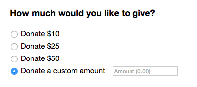
The Radios component is interesting because we are actually passing all of the possible values through in a simple array. We also have an optional text field for adding user-generated text, which has its own validation.
The rest of the components are specific to this donation form, but are separated into new components in order to simplify the DownationForm component code. Let’s take a deeper look at those now.
Creating input fields
One component that will be reused in every form field component is an error message. If we want to validate fields as the user enters them, we need to be able to bring up an error message as they are typing. So, let’s start with that:
var InputError = React.createClass({
  getInitialState: function() {
    return {
      message: 'Input is invalid'
    };
  },
  render: function(){
    var errorClass = classNames(this.props.className, {
      'error_container':   true,
      'visible':           this.props.visible,
      'invisible':         !this.props.visible
    });

    return (
      <div className={errorClass}>
        <span>{this.props.errorMessage}</span>
      </div>
    )
  }

});
This component is very small, but powerful. All we have to do when calling this component is include an error message, and a boolean value that tells the component whether it should be displayed or not. The css file (included in the download) will do the rest.
Now let’s take a look at all of our form field components:
var TextInput = React.createClass({
  getInitialState: function(){
    //most of these variables have to do with handling errors
    return {
      isEmpty: true,
      value: null,
      valid: false,
      errorMessage: "Input is invalid",
      errorVisible: false
    };
  },

  handleChange: function(event){
    //validate the field locally
    this.validation(event.target.value);

    //Call onChange method on the parent component for updating it's state
    //If saving this field for final form submission, it gets passed
    // up to the top component for sending to the server
    if(this.props.onChange) {
      this.props.onChange(event);
    }
  },

  validation: function (value, valid) {
    //The valid variable is optional, and true if not passed in:
    if (typeof valid === 'undefined') {
      valid = true;
    }

    var message = "";
    var errorVisible = false;

    //we know how to validate text fields based on information passed through props
    if (!valid) {
      //This happens when the user leaves the field, but it is not valid
      //(we do final validation in the parent component, then pass the result
      //here for display)
      message = this.props.errorMessage;
      valid = false;
      errorVisible = true;
    }
    else if (this.props.required && jQuery.isEmptyObject(value)) {
      //this happens when we have a required field with no text entered
      //in this case, we want the "emptyMessage" error message
      message = this.props.emptyMessage;
      valid = false;
      errorVisible = true;
    }
    else if (value.length < this.props.minCharacters) {
      //This happens when the text entered is not the required length,
      //in which case we show the regular error message
      message = this.props.errorMessage;
      valid = false;
      errorVisible = true;
    }

    //setting the state will update the display,
    //causing the error message to display if there is one.
    this.setState({
      value: value,
      isEmpty: jQuery.isEmptyObject(value),
      valid: valid,
      errorMessage: message,
      errorVisible: errorVisible
    });

  },

  handleBlur: function (event) {
    //Complete final validation from parent element when complete
    var valid = this.props.validate(event.target.value);
    //pass the result to the local validation element for displaying the error
    this.validation(event.target.value, valid);
  },
  render: function() {

    return (
      <div className={this.props.uniqueName}>
        <input
          placeholder={this.props.text}
          className={'input input-' + this.props.uniqueName}
          onChange={this.handleChange}
          onBlur={this.handleBlur}
          value={this.state.value} />

        <InputError
          visible={this.state.errorVisible}
          errorMessage={this.state.errorMessage} />
      </div>
    );
  }
});
The first one is our InputText component. This component includes some validation based on the props sent from the parent. In this case, we show an error message when there are not enough characters, but we show a different message when the field is empty. Both messages were sent as props. All of this validation occurs while the user is typing. This could be annoying for some fields, but it’s a great example of what is possible.
In addition to the local validation, we also call the parent validation function when the user leaves the field (indicating they are finished with it). You could also do all validation in the parent, or just do local validation. There are many options.
var Radios = React.createClass({
  getInitialState: function() {
    //displayClass is the class we use for displaying or hiding
    //the optional "any value" text field
    return {
      displayClass: 'invisible',
      valid: false,
      errorMessage: "Input is invalid",
      errorVisible: false
    };
  },
  handleClick: function(displayClass, e) {
    //if we click any option other than the "any value" option,
    //we hide the "any value" text field. Otherwise, show it
    if (displayClass == 'invisible') {
      this.setState(
        {
          displayClass: displayClass,
          errorVisible: false
        }
      );
    }
    else {
      this.setState({displayClass: displayClass});
    }
  },
  handleAnyChange: function(e) {
    //this validation is specifically for the optional "any value" text field
    //Since we have no idea what the requirements are locally, we call the parent
    //validation function, then set the error states accordingly
    if (this.props.anyValidation(e.target.value)) {
      this.setState(
        {
          valid: true,
          errorMessage: "Input is invalid",
          errorVisible: false
        }
      );
    }
    else {
      this.setState(
        {
          valid: false,
          errorMessage: this.props.anyErrorMessage,
          errorVisible: true
        }
      );
    }
  },
  render: function() {
    var rows = [];
    var label = "";

    //we have passed in all the options for the radios, so we traverse the array
    for (var i = 0; i < this.props.values.length; i++) {
      //We do this little replace for when we want to display the value as part of
      //additional text. Otherwise, we would just put '[VALUE]' when passing
      //the itemLabel prop from the parent component, or leave out '[VALUE]' entirely
      label = this.props.itemLabel.replace('[VALUE]', this.props.values[i]);

      //You'll see that even the <br /> field has a key. React will give you errors
      //if you don't do this. This is just an axample of what's possible, but
      //you would normally add extra spacing with css
      rows.push(<input
        key={this.props.name + '-' + i}
        type="radio"
        ref={this.props.name + '-' + this.props.values[i]}
        name={this.props.name}
        value={this.props.values[i]}
        onClick={this.handleClick.bind(this, 'invisible')} />,

        <label key={this.props.name + '-label-' + i} htmlFor={this.props.values[i]}>{label}</label>,

        <br key={this.props.name + '-br-' + i} />);
    }

    //The "any value" field complicates things a bit
    if (this.props.addAny) {
      //we passed in a separate label just for the option that
      //activates the "any value" text field
      label = this.props.anyLabel;
      rows.push(<input
        key={this.props.name + '-' + i}
        type="radio"
        ref={this.props.name + '-any'}
        name={this.props.name} value="any"
        onClick={this.handleClick.bind(this, 'visible')} />,

        <label key={this.props.name + '-label-' + i} htmlFor={this.props.values[i]}>{label}</label>);

      //and now we add the "any value text field, with all its special variables"
      rows.push(<div key={this.props.name + '-div-' + (i+2)} className={this.state.displayClass}>
        <input
          className="anyValue"
          key={this.props.name + '-' + (i+1)}
          type="text"
          placeholder={this.props.anyPlaceholder}
          onChange={this.handleAnyChange}
          ref={this.props.name} />
      </div>);
    }

    //Now we just return all those rows, along with the error component
    return (
      <div className="radios">
        {rows}

        <InputError
          visible={this.state.errorVisible}
          errorMessage={this.state.errorMessage} />
      </div>
    );
  }
});
Next up is our Radios component. This component actually doesn’t have any validation unless the optional “addAny” prop is set to true. In that case, an extra radio button is added which will display an “anyValue” text field when selected. This text field gets its own validation function, called through the props sent from the parent.
We also have to handle the appearing and disappearing act of the text field. When the “addAny” radio button is clicked, the text field is displayed. When any other option is selected, it’s hidden. We do this with an onClick attribute, but we have to use “bind” in order to send a variable to our handler function. The variable tells the function whether to show or hide the text field.

The validation handler for the text field simply calls the parent validation field, and uses that result to determine whether to show the InputError component.
You’ll notice that some of the code looks a bit wonky because there are keys for even the <label> and <br /> tags. This is to prevent errors, because React requires a key for all fields. Since we are sending all the values to the Radios component, we have to traverse a for loop of values. JSX can’t just be placed raw into the for loop, so we push each row of JSX to an array. When we do it this way, the keys aren’t automatically included, so we have to include them in every single tag.
Now let’s take a look at a couple of custom form field components.
var Payment = React.createClass({
  //we have no error checking for this one, so there are no error states
  getInitialState: function() {
    return {
      displayClass: 'invisible'
    };
  },
  handleClick: function(displayClass, e) {
    //we simply set the state in order to update the display when
    //we want to show the extra options
    this.setState({displayClass: displayClass});
  },
  render: function() {
    //we take full control over the checkbox that allows us to show additional options
    //this will ensure that we truly toggle the options, and don't wind up with a case
    //where the checkbox is not checked but the extra options show and vice versa
    var optionsClass = "invisible";
    var isChecked = false;
    if (this.state.displayClass == 'invisible') {
      optionsClass = "visible";
    }
    else {
      isChecked = true;
    }

    //We could have extra checkboxes, but this is just to show how to properly show other options
    //when a checkbox is checked. We won't do error checking on the payment info here.
    return (
      <div className="payment">
        <a href="#">PayPal button goes here</a>
        <br />
        <input type="checkbox" checked={isChecked} onChange={this.handleClick.bind(this, optionsClass)} name="card" />Pay with card<br />
  	    <div id="Choices" className={this.state.displayClass}>Credit Card Information<br />
  		    <input type="text" placeholder="Card number" ref="card" />Card number<br />
  		    <input type="text" placeholder="CVV" ref="cvv" />CVV<br />
  		    <input type="text" placeholder="etc" ref="whatever" />Etc<br />
  	    </div>
        <InputError
          visible={this.state.errorVisible}
          errorMessage={this.state.errorMessage} />
      </div>
    );
  }
});

var Department = React.createClass({
  getInitialState: function() {
    return {
      displayClass: 'invisible'
    };
  },
  handleClick: function(e) {
    //We're doing another one of these "any value" fields, only shown when
    //a specific "other" option is chosen
    var displayClass = 'invisible';
    if (e.target.value == 'other') {
      displayClass = 'visible';
    }
    this.setState({displayClass: displayClass});
  },
  render: function() {
    //This is a select field with options and sub-options, plus an "any value" field
    return (
      <div className="department">
        <select onChange={this.handleClick} multiple={false} ref="department">
          <option value="none"></option>
          <optgroup label="College">
            <option value="muir">Muir</option>
            <option value="revelle">Revelle</option>
            <option value="sixth">Sixth</option>
          </optgroup>
          <optgroup label="School">
            <option value="jacobs">Jacobs School of Engineering</option>
            <option value="global">School of Global Policy and Strategy</option>
            <option value="medicine">School of Medicine</option>
          </optgroup>
          <option value="scholarships">Scholarships</option>
          <option value="other">Other</option>
        </select>
        <div className={this.state.displayClass}>
          <input className="anyValue" type="text" placeholder="Department" ref="any-department" />
        </div>

        <InputError
          visible={this.state.errorVisible}
          errorMessage={this.state.errorMessage} />
      </div>
    );
  }
});
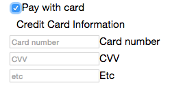
Payment validation is beyond the scope of this tutorial, but we’ve included a payment section since donations need a way to donate money! Our Payment component also shows a common example of how payments are accepted. There may be some sort of PayPal button, then an option to fill in payment information directly. This is just a simple example of showing a new section of information when a checkbox is clicked.
One thing that can be annoying about checkbox toggling is that it can get out of sync. In order to prevent that, we take full control over it. When the credit card fields are toggled off, we ensure that the checkbox is not checked. When they are on, the checkbox is checked.
In the Department component, we have included select options with sub-options, plus an option to put any value. This is somewhat similar to what we’ve done in the previous examples of showing and hiding other fields. The main reason it’s included here is to show how we handle this action in every type of field that gives multiple options. It’s also a good example of how to do sub-options.
One other thing to note about the select field is the multiple={false} attribute. That’s not required, but it’s included here in order to show that it’s possible to have a select field that takes multiple values. When the attribute is set to true, all of the options will be shown in a box rather than appearing as a drop-down. The returning value is then an array.
Questions or Comments?
What did you think of this tutorial? Do you have any questions or comments? What else would you like me to write about? Please let me know in the comments section below.


