You can access the full course here: Bite-Sized React
Table of contents
File & Base Setup
In this lesson, we use what we’ve learned about JSX to build a composable UI using the example of a Tweet!
The Tweet structure will have an Avatar, Name, HandleName, Relative Time, Message, and 4 Icon Buttons.

Just as we discussed in detail in the HelloWorld section, make sure you have your Terminal open and are in the directory where you want to create your new project. In the video lesson a project directory on the Desktop called React is used to hold all course projects (you can choose any directory location and name). Use your terminal to change into your project directory.

Now that your terminal is in the project directory, use the Create-React-App command to begin a new project. In the terminal, enter the command:
npm init react-app static-tweet && cd static-tweet
This command will create a basic working React app called static-tweet, install our dependencies from NPM and finally change the working directory to be our new project inside the terminal.
The generated project contains some files we won’t be using for this demo so you can ignore them or delete them with this command:
rm src/App.* src/logo.svg src/s*.js
Open your project in VS Code. Either open the application VS Code and use File/Open from the menu or type the following into the terminal:
code .
In the video lesson we start by adding FontAwesome to our React project. FontAwesome gives us access to the icons we will use in this lesson for buttons we are creating. To access these icons we will need to add it as a stylesheet in our index.html file. In VS Code, open the index.html file in the public folder to add this link statement:
<!-- index.html -->
<link rel="stylesheet" href="https://use.fontawesome.com/releases/v5.0.12/css/all.css"/>
Place this stylesheet link in the <head> section of index.html just above the <title> tag:
<!DOCTYPE html>
<html lang="en">
  <head>
    <meta charset="utf-8" />
    <meta name="viewport" content="width=device-width, initial-scale=1" />
    <!-- (start) FontAwesome link - add this line to include Icons -->
    <link
      rel="stylesheet"
      href="https://use.fontawesome.com/releases/v5.0.12/css/all.css"
    />
    <!-- (end) FontAwesome link -->
    <title>React App</title>
  </head>
  <body>
    <noscript>You need to enable JavaScript to run this app.</noscript>
    <div id="root"></div>
  </body>
</html>
You can browse or search for icons on the FontAwesome website: https://fontawesome.com/icons?d=gallery&m=free.
In VS Code, open the src/index.css file and add the styles for a tweet class by copying from the course download files or text below:
/* index.css */
.tweet {
  border: 1px solid #cccccc;
  width: 564px;
  min-height: 68px;
  padding: 10px;
  display: flex;
  font-family: "Helevetica", arial, sans-serif;
  font-size: 14px;
  line-height: 18px;
}
While CSS is outside the scope of this course, including the CSS from the download files will make your app look better by adding border, width, height, font style and padding around our tweet element.
Tweet Component
Next, we’ll setup our src/index.js file in a similar way as we did in the HelloWorld lesson. Start by deleting all the contents and then import React and ReactDom modules as well as the index.css we created above.
// index.js
import React from 'react';
import ReactDOM from 'react-dom';
import './index.css';
React will need to be imported into all files that use React.
ReactDom is needed only needed in this index.js file to render the React code to the web page HTML known as Document Object Model (DOM).
Note: Notice that the CSS is imported in a different way. The first thing to realize is that we are importing the entire index.css file and secondly notice that it is not simply imported using a string (which is interpreted as a node dependency like ‘react’). We actually import a relative path ‘./’ (meaning in the same directory as current file) and use the file extension ‘.css’ otherwise ‘.js’ would be assumed.
Tweet Component
Next create the Tweet Component just like we created the HelloWorld component in a previous lesson.
// index.js
function Tweet() {
  return (
    <div className="tweet">
      Tweet
    </div>
  );
}
Note: In the JSX lessons, we noted that while JSX is a HTML-like syntax there are a couple things to watch out for. One is that while we would reference a class in HTML with the class keyword, we cannot do that in JavaScript (JS) since class is a JS keyword. React instead uses className.
Finally, we add our render logic and our index.js file now looks like this:
// index.js
import React from "react";
import ReactDOM from "react-dom";
import "./index.css";

function Tweet() {
  return <div className="tweet">Tweet</div>;
}

ReactDOM.render(<Tweet />, document.querySelector('#root'));
Test the App
In the terminal, start the app by typing:
npm start
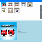
You see your Chrome browser open up to localhost:3000 and display something like this:

Open Google Developer Tools by inspecting the page. Under the Elements tab notice in the <head> of the document there is a <style> tag that we didn’t put there. This is the contents of our index.css we imported into our index.js JavaScript file.
Tweet Sub-Components
Next, it’s time to build some components that will be composed together inside the Tweet Component.
Let’s start with Avatar which will be a component that returns an <img> tag. Code the following function inside index.js:
// index.js
function Avatar() {
  return (
    <img
      src='https://gravatar.com/avatar/nothing'
      alt='avatar'
      className='avatar'
    />
  );
}
Next, add some CSS to our index.css file for the class of avatar:
.avatar {
  width: 48px;
  height: 48px;
  border-radius: 5px;
  margin-right: 10px;
}
Lastly, we can now modify our Tweet Component to use the Avatar Component alongside the word Tweet:
// index.js
function Tweet() {
  return (
    <div className='tweet'>
      <Avatar />
      Tweet
    </div>
  );
}
Finally, with the render logic included, our index.js file now looks like this:
// index.js
import React from 'react';
import ReactDOM from 'react-dom';
import './index.css';

function Tweet() {
  return (
    <div className='tweet'>
      <Avatar />
      Tweet
    </div>
  );
}

function Avatar() {
  return (
    <img
      src='https://gravatar.com/avatar/nothing'
      alt='avatar'
      className='avatar'
    />
  );
}

ReactDOM.render(<Tweet />, document.querySelector('#root'));
Our browser output now looks like this:

Open the Chrome Developer Tools and select the Components tab. As discussed in the Getting Started section, the Components Tab is installed with the React-Developer-Tools and allow us to view React in terms of components. In other words, we see the app the way React sees it.
Notice our Tweet is now composed of two components; the parent Tweet and child Avatar.
Final Details
In the last lesson we started to build our static tweet. We got as far as putting our Avatar within our Tweet. Next, we’ll add the Message, Time, Name and Handle components.

Keep in mind our desired Tweet Structure, let’s first code our static Message Component, we’ll simply return a string of text ensuring we wrap the text in a <div> (because we want it on its own line) and provide a className so we can add CSS style. Ensure to copy the CSS from the course download files in the static-tweet directory in the src/index.css file.
// index.js
function Message() {
  return (
    <div className="message">This message is less than 140 characters!</div>
  );
}
Next, let’s code our NameWithHandle Component:
// index.js
function NameWithHandle() {
  return (
    <span className="name-with-handle">
      <span className="name">Your Name</span>
      <span className="handle">@yourhandle</span>
    </span>
  );
}
The CSS to style name and handle; added to our index.css is:
/* index.css */
.name {
  font-weight: bold;
  margin-bottom: 0.5em;
  margin-right: 0.3em;
}

.handle {
  color: #8899a6;
  font-size: 13px;
}
Next, let’s code the Time Component:
// index.js
const Time = () => <span className="time">3h ago</span>;
We can also construct simple components are variables set equal to an arrow function that returns JSX. As long as the JSX returned is valid, React don’t care if we use a variable or a regular function.
For Time we provide the following CSS in index.css:
/* index.css */
.time {
padding-left: 0.3em;
color: #8899a6;
}
.time::before {
content: "�0b7";
padding-right: 0.3em;
}Next, we code our Button Components:
// index.js
const CommentButton = () => <i className="far fa-comment" />;
const RetweetButton = () => <i className="fa fa-retweet retweet-button" />;
const LikeButton = () => <i className="fa fa-heart like-button" />;
const ShareButton = () => <i className="fas fa-external-link-alt" />;
We can also construct simple components are variables set equal to an arrow function that returns JSX. As long as the JSX returned is valid, React don’t care if we use a variable or a regular function.
For Time we provide the following CSS in index.css:
/* index.css */
.button {
  margin-top: 10px;
  margin-left: 2px;
  font-size: 1.4em;
  color: #aab8c2;
}

.button i {
  width: 80px;
}
Finally, we modify our Tweet Component to use the new Components we just created. The final index.js looks like this:
// index.js
import React from "react";
import ReactDOM from "react-dom";
import "./index.css";

function Tweet() {
  return (
    <div className="tweet">
      <Avatar />
      <div className="content">
        <NameWithHandle /> <Time />
        <Message />
        <div className="button">
          <CommentButton />
          <RetweetButton />
          <LikeButton />
          <ShareButton />
        </div>
      </div>
    </div>
  );
}

function Avatar() {
  return (
    <img
      src="https://gravatar.com/avatar/nothing"
      alt="avatar"
      className="avatar"
    />
  );
}

function Message() {
  return (
    <div className="message">This message is less than 140 characters!</div>
  );
}

function NameWithHandle() {
  return (
    <span className="NameWithHandle">
      <span className="name">Name</span>
      <span className="handle">@HandleName</span>
    </span>
  );
}

const Time = () => <span className="time">3h ago</span>;

const CommentButton = () => <i className="far fa-comment" />;
const RetweetButton = () => <i className="fa fa-retweet retweet-button" />;
const LikeButton = () => <i className="fa fa-heart like-button" />;
const ShareButton = () => <i className="fas fa-external-link-alt" />;

ReactDOM.render(<Tweet />, document.querySelector("#root"));
For our CSS styles, the final index.css looks like this:
/* index.css */
.tweet {
border: 1px solid #cccccc;
width: 564px;
min-height: 68px;
padding: 10px;
display: flex;
font-family: Arial, Helvetica, sans-serif;
font-size: 14px;
line-height: 18px;
}
.avatar {
width: 48px;
height: 48px;
border-radius: 5px;
margin-right: 10px;
}
.name {
font-weight: bold;
margin-bottom: 0.5em;
margin-right: 0.3em;
}
.handle {
color: #8899a6;
font-size: 13px;
}
.time {
padding-left: 0.3em;
color: #8899a6;
}
.time::before {
content: '�0b7';
padding-right: 0.3em;
}
.button {
margin-top: 10px;
margin-left: 2px;
font-size: 1.4em;
color: #aab8c2;
}
.button i {
width: 80px;
}Tip: converting regular-functions to arrow-functions
React allows us the option of using variables to hold JSX components created using Arrow-Functions. Arrow functions are shorthand functions that automatically bind to the surrounding context (the this keyword in JavaScript). Arrow functions are extremely useful in many cases, especially where assigning to a variable or anywhere Anonymous Functions would normally be used such as in JavaScript callbacks in Promises or Async functions.
Let’s further explore Arrow functions by observing the transformation of a regular-function to an arrow-function. Consider our Time component.
To transform a function to a variable assigned an arrow-function follow four steps:
transform:
function Time() {
  return <span className="time">3h ago</span>;
}- Remove function keyword
- Declare variable as const/let/var in front of function name removing ( )
- Set variable = to empty ( ), space, => (arrow) followed by a space and the rest of the function as it looked previously
- If arrow function contains only one expression then { } can be removed along with return statement as JavaScript treats this as an implicit return
to:
const Time = () => {
  return <span className="time">3h ago</span>;
};const Time = () => <span className="time">3h ago</span>;
In the next section we will look at how to make our React components more dynamic by using React Props.
Transcript
File & Base Setup
Welcome back. With our new found knowledge of components, let’s build a tweet to put that knowledge to the test.
The best way, I found, to build an application is to sketch out a rough draft before jumping into the deep end. A tweet consists of an avatar and or name, time, message, reply button, retweet button and more options button. For a simple hierarchy like this one, let’s start from the top down, basically, build the tweet component first, then it’s nested component.
To get started, create a new project with create React app by running this command in your terminal, npm initiate react-app static-tweet n cd static-tweet. Remember to do this in the directory that you would like to save all your applications. For me I’m saying it on my desktop in a folder called React. The second part of this command will take you right into the project directory once created.
The project was created with a few files we won’t use. Let’s go ahead and delete them with this command, rm src/App.* src/logo.svg src/registerServiceWorker .js. With that taken care of, open up the project in Visual Studio Code. Remember, file, open, then select the STATIC-TWEET folder.
You’ll notice here that the project has an index.html, we’ll need to add Font Awesome as a style sheet, this will allow us to use their icons for the buttons we’ll be creating Add Font Awesome by putting this line inside of the head tag.
Moving on, you’ll also see that in index.css file was generated in the source directory, open it up and replace its contents with this tweet class. This is just some basic CSS to give our tweets some style. Right now we’re only assigning a border of one pixel, solid, light gray color, a width of 564 pixels, the minimum height would be 68 pixels, padding around our border, 10 pixels, it’s going to be displayed flex, font family will be Helvetica, font size is 14 pixels and line height is 18 pixels.
Tweet Component
Next, let’s move on to our index.js file. The content here will be very similar to the one from HelloWorld.
So we’re going to go ahead and import our React from react, import ReactDom from react-dom and import our index.cs. Then write our Tweet function as we did our HelloWorld function before. And then we’re just gonna throw inside there Tweet print something out. Then we’re going to do our ReactDom.render and render our tweet component to root.
If you notice, we have two new elements in our component. First, we have a new import call that is import ./index.css which is importing a CSS file into a JavaScript file. What’s happening is that behind the scenes, when webpack builds our app, it sees this CSS import and learns that the index.js depends on index.css. Webpack reads the CSS file and includes it in the bundle JavaScript as a string to be sent to the browser.
Lastly, we add className equals tweet, which is the same as HTML class attribute used to define equal styles of element with the same class name. className value becomes the class attribution on the DOM node.
Now let’s run our application the same as before by opening our terminal in VS Code and typing in the command npm start. We get the bare bones. When we inspect the page using Google Developer Tools, look at the Elements tab and notice under Head, there’s a Style tag that we didn’t put there. It contains the content of index.css.
Let’s add some component. Next, we’ll need to build our avatar component. Shooting back over to index.js file, add function Avatar and that Avatar is going to return an image tag and in our image, we’re going to need a source. Our source is going to be https://www.gravtar.com/avatar/nothing and then our image also needs a className, which is going to equal avatar and then an alt that’s also going to equal avatar. The image tag is simple HTML. The only thing we are changing is class to className. For that, we’re going to use Gravtar to create our icon. Next, we’ll need to add the avatar component to our tweet.
So moving up to the tweet that we just created, we’ll add the avatar component. And just like that, our Tweet component is coming to life. Let’s give our avatar a bit of style. In the index.css file, add this class. And there you have it. Our tweet is slowly but surely coming together. See ya next time.
Final Details
So for our message component, we’re gonna do the same as we did for our tweet component. That message is going to return a div with a className of message and in between our div, we’re going to put this is less than 140 characters and then for our NameWithHandle component, we’re gonna change it up and that’s going to return a span with a className of NameWithHandle. And within that span, we’re going to have another span with a className of name, Your Name. Close that span and a secondary span at yourhandle. Close that span and close the initial span.
Now we need to add our recently created message and handle name components into our Tweet. So if we move up to our Tweet, we’ll add a div with a className of content. And inside of that div we’re going to put NameWithHandle component and our Message component.
And now shooting over to the index.css we’re going to add a bit of style to spruce up the look and feel. So we’re gonna add a name class and a handle class. Next up we’ll need to add the time and other button. We’re going to construct these a little differently than our previous components.
This component doesn’t look like the functions you’ve been writing up to this point but they are in fact still functions. They’re Arrow Function. These are shorthanded functions that automatically bind to the surrounding context. Here’s a progression from a Regular Function to an Arrow Function. So you can see what’s happening. Here’s a Normal Function component. It can then be written as an anonymous function and stored in a variable. It can then be simplified by removing the braces and the return.
Let’s finish up by creating our CommentButton, RetweetButton and ShareButton with Arrow Function. The eye tag that is within our button arrow functions is simple HTML for icon and the className is being pulled from Font Awesome. From here all we have to do now is add our time and our buttons within our tweet function and we are complete.
Let’s go ahead to the terminal and run our static tweet. We see that everything looks great. In the next lesson we’ll learn about props and how to make reusable components with props. See you next time.
Interested in continuing? Check out the full Bite-Sized React course, which is part of our Bite-Sized Coding Academy.
