You can access the full course here: Intro to Bootstrap
Table of contents
Part 1
Have you ever tried to build a website or webapp from scratch? If you have, you may have found it to be a lengthy and sometimes frustrating process. The end result often doesn’t look as good as the initial plan and it can be difficult to achieve the desired layout and responsiveness to different screen sizes. Styling a webpage to a production level of finish can take a long time if doing everything from scratch.
This is where Bootstrap swoops in to save the day! Bootstrap is a framework that makes building a webpage quick and easy through the use of grid structures and pre-formatted widgets. It contains a vast library of styled widgets and frames that allow users to quickly build appealing webpages with very little effort.
By using pre-formatted templates for widgets, Bootstrap users save time and frustration that would be spent on styling each individual element. Bootstrap provides well-designed widget and frame templates that look good and respond appropriately without any customization. Base widgets come in a variety of flavours which can be further customized with CSS to provide unlimited and easy-to-use options. For example, on the left is a button with Bootstrap and on the right is a button without Bootstrap:

This is a noticeable improvement and requires only that we assign a bootstrap class to the button element.
Bootstrap is very simple to use. There are 5 basic steps:
- Add the bootstrap headers into an HTML file
- Find the widgets and layout styles that you want on the bootstrap website
- Copy the code for the element from the website and paste it into your HTML file
- Add customizations from the bootstrap library to the element
- Customize the element further with your own CSS
So now that you know what Bootstrap is, let’s take a look at the webpage to get a feel for how to use it and what options are available.
Part 2
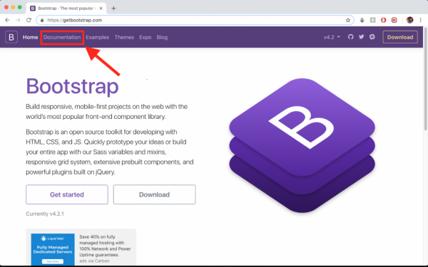
An important part of using Bootstrap is getting familiar with the website. It’s a copy-and-paste framework so learning how to navigate the website to find the widgets and frames that we want will save us time in the long run. Here we will take a look at the Bootstrap documentation, examine a few elements to see what the source code looks like, and then see how to add the element to our webpages. For now, we will spend most of our time in the documentation:

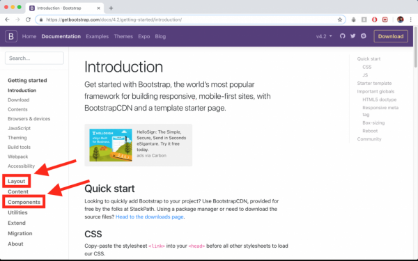
In the documentation, we can find the layout and frame elements under the tab “Layout” and the widgets and other components under the “Components” tab.

Let’s quickly check out a few of the components to get a feel for how Bootstrap code works. Each component page gives an overview of what the element is used for and provides various examples with the source code and the output. We will examine Alerts, Buttons, and Dropdowns.
Alerts
Alerts are used to display some sort of message such as a warning or a notification. Here are a few examples of Bootstrap alerts:

And the source code the generate the outputs looks like this:
<div class="alert alert-primary" role="alert">
  A simple primary alert—check it out!
</div>
<div class="alert alert-secondary" role="alert">
  A simple secondary alert—check it out!
</div>
<div class="alert alert-success" role="alert">
  A simple success alert—check it out!
</div>
Note how each of the components is just a div with the class “alert” applied to it and the different alert-options give different outputs
Buttons
Buttons are used to trigger some action when pressed; almost every webpage will use buttons at some point. The basic examples look like this:

And the source code to generate the outputs looks like this:
<button type="button" class="btn btn-primary">Primary</button>
<button type="button" class="btn btn-secondary">Secondary</button>
<button type="button" class="btn btn-success">Success</button>
<button type="button" class="btn btn-danger">Danger</button>
<button type="button" class="btn btn-warning">Warning</button>
<button type="button" class="btn btn-info">Info</button>
<button type="button" class="btn btn-light">Light</button>
<button type="button" class="btn btn-dark">Dark</button>

<button type="button" class="btn btn-link">Link</button>
Note that this time, the element is of type “button” and not “div” like with the alert. This time, the “btn” class is used to provide default style behaviour to the buttons with “btn-option” added to the end to further customize the button appearance.
Not all buttons are of the “button” element type. For example, radio buttons or checkboxes are considered inputs:

<div class="btn-group btn-group-toggle" data-toggle="buttons">
  <label class="btn btn-secondary active">
    <input type="radio" name="options" id="option1" autocomplete="off" checked> Active
  </label>
  <label class="btn btn-secondary">
    <input type="radio" name="options" id="option2" autocomplete="off"> Radio
  </label>
  <label class="btn btn-secondary">
    <input type="radio" name="options" id="option3" autocomplete="off"> Radio
  </label>
</div>
Dropdowns
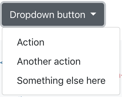
Dropdowns are commonly used in menu bars and provide some hidden options to choose from when a user clicks on the initial button. An expanded dropdown might look like this:

And the source code to generate this is:
<div class="dropdown">
  <button class="btn btn-secondary dropdown-toggle" type="button" id="dropdownMenuButton" data-toggle="dropdown" aria-haspopup="true" aria-expanded="false">
    Dropdown button
  </button>
  <div class="dropdown-menu" aria-labelledby="dropdownMenuButton">
    <a class="dropdown-item" href="#">Action</a>
    <a class="dropdown-item" href="#">Another action</a>
    <a class="dropdown-item" href="#">Something else here</a>
  </div>
</div>
Note how this one is a set of elements enclosed in the “dropdown” class. There is the initial button and the dropdown menu with the menu options as “a” elements
So now you have an idea of how Bootstrap builds and styles the elements, let’s take a look at how to add the Bootstrap library to an HTML file.
Transcript 1
Hello everyone, and welcome to our tutorial series on an Intro to Bootstrap. My name is Nimish and I’ll be guiding you through the next videos in which we’ll be getting an intro into what Bootstrap is and how to use it.
Once we are comfortable using Bootstrap, we can then move on to actually building a few projects and I’ll let Mario take over. So for starters, what is Bootstrap? Well Bootstrap is simply an open source framework that’s used to develop websites and web apps. Basically, anything web related. Bootstrap is generally based on HTML and CSS, there’s a little bit of JavaScript functionality in there, but mostly it’s just pure HTML and CSS. And Bootstrap provides pre-formatted templates for common frames and widgets.We basically use these pre-formatted frames and widgets to help build up our web pages by specifying containers and adding in the necessary widgets.
So why bother using Bootstrap? Well, for starters, Bootstrap just generally makes web development easier and faster. Using Bootstrap allows us to quickly build good looking web pages and web apps with relatively little work. The widgets and frames provided are pre-formatted to already look good. This eliminates the need to go through and painstakingly apply CSS formatting to every single HTML element or frame that we want to add into our web page.
Basically, using Bootstrap we can build up a web page that looks good very, very quickly rather than having to build first the HTML frame and then go through each individual container and element and style it. For example, using Bootstrap, we can just simply add a button to our page, specify it to be off the Bootstrap button class and it will likely already have some kind of color, it will probably have rounded edges, maybe a nice font, on-hover behavior among others. These are all attributes that we would have to specify ourselves if we were not using something like Bootstrap.
Now, we’ll really quickly talk here about how to use Bootstrap then we’ll end this section and head on over to the actual web page itself where we’ll get a better understanding. There are four basic steps to using Bootstrap. The first will be to add the necessary header files to your HTML file, or rather header tags. Once we have those header tags added, that gives us access to the entire Bootstrap framework. We then go online to the Bootstrap web page and we find the widget and frames that we want and basically just copy and paste the code from there.
One of the best things about Bootstrap is that it’s open source, so we can literally take the source code provided and use that right in our web pages. So let’s say we wanted a couple of buttons in our web page. We’d simply go to the Bootstrap web page, find out where the buttons are stored and all the information about them, we could choose the kind of customization we want, and then we can literally copy and paste the code right from the web page into our own HTML file.
Step number three is further customizing widgets and frames by implementing other options. Let’s go back to that button example. There isn’t just one type of button in Bootstrap, there are many other ways we can customize our button. For example, perhaps we’ll want a large versus a small button. Perhaps we’ll want a certain font, or a completely circular button, versus a square button. After this comes step number four, which is to customize our elements further using custom CSS.
Of course, we don’t just have to use everything that Bootstrap provides, we can customize things even further. Let’s say I wanted a very specific width and height for my button. Well, if we were to just use a pure Bootstrap button, it come with a set width and height that varies a little bit depending on the content and the style of button we use. But let’s say I want my button to be exactly 150 pixels in width, well, I can absolutely do that, I’d maybe just give that button an ID, or I’d go right into the buttons class, and then under my CSS, I can add in a custom width and height to that button.
So we can essentially do everything that we would do with a regular webpage, applied to those Bootstrap elements. Bootstrap is really just there to provide us a pre-implemented and pre-formatted widget or frame that we can then customize further.
Okay, so this has been a really quick intro into what Bootstrap is and how to use it, like I said in the next section, we’ll be taking a look at the Bootstrap webpage itself, and getting an idea of how to first grab the elements we want and then how to add them to our code. Thanks very much for watching, we’ll see you guys in the next section.
Transcript 2
Hello, everyone, and welcome to our tutorial on exploring the Bootstrap website. Here, what we’re gonna do is navigate to our Bootstrap website. We’re gonna open up the documentation and we’ll just take a look at a few examples to gain an understanding of how to use Bootstrap.
So, step number one, get to the website. Step number two, open up the documentation part. Step number three, we’ll be examining a few choice elements. And step number four, we’ll be discovering how to add these elements to our web apps, so we’ll be taking a look at the source code themselves. After this, I’d encourage you guys to play around a little bit before moving to the next section just to familiarize yourselves a bit more. So, let’s head on over there now.
I’m just gonna open a new tab here. I’m using Chrome, although feel free to use whichever browser you’d like and we’re gonna search for Bootstrap. We’re gonna go to this first link here, getbootstrap.com, and we’re gonna ignore this stuff. I’ll show you how to download and incorporate Bootstrap a little bit later. What we’re gonna do is head on over to Documentation up top. And we’re actually gonna skip over this Getting Started. This just shows you how to add in the necessary headers, or rather, the necessary tags to our header file in order to actually gain access to Bootstrap’s framework.
What we’ll take a quick look at is gonna be Layout. Although, we won’t spend a ton of time on this because we will be focusing specifically on the grid layout in, I believe, the next section. Just for now, let’s take a really quick look at that. You’ll note that Bootstrap, this webpage, and pretty much all of the pages in our Bootstrap documentation are formatted this way. They’ll have the actual examples of what something will look like using the Bootstrap code, and then the code that is used to generate this.
So, this might be a container class, you’d have some content, and it might look something like this. This might be a fluid container class and it might look something like this, okay? Like I said, we’ll be using grid for the most part and we’ll just take a quick look at that, specifically. Grid is gonna be the basic way in which we’ll lay stuff out using Bootstrap.
It’s actually very easy to use, kind of follows a little bit like the tables in HTML, which will have the overall structure, in this case, just a container. Each is divided into various rows. In this case, this is one row, I believe. The next one is a few rows, so this one is two rows here. And then there are columns for each rows. This is first column, second column, and third column. As you can see, we’ve got the overall container, we’ve got one row, and then we have three columns here. So, that’s your general grid structure.
We will actually come back to this and examine this in greater detail. For now, I just wanna take a really quick look at how the documentation’s formatted. So, like I said, most of the pages are laid out this way. We’ll have the actual element or what we’re trying to understand here. We’ll have the actual example as it would be outputted if we were to run the code.
And then we would have the code that would actually generate that example. So, if we were to literally copy and paste this into an HTML file with of course the correct tags, and we would then run that page maybe on a browser or something, it would look exactly like this. And that’s how the rest of the documentation is going to work. Now, just taking a look at the grid code isn’t terribly interesting, so let’s jump on over to some components and we’ll just take a really quick look at a few of these.
So, Alerts, let’s start with Alerts ’cause they’re the very first element or very commonly used. So, very often, you might click on something and it says you’re good to go or maybe it says you can’t do that, maybe even need some input. So, we’ve all used alerts and we’ve all seen them pop up.
Well here, we get to use the custom Bootstrap alerts class and we might get some nice-looking alerts like this. So here are some examples of our alerts, that’s the main element that we’re looking at up top, and then we’ll take a look at some really quick examples. So, it tells you a bit about it, what it’s used for, and then it shows you some examples of how it would look once the code is run. And then of course the code that actually generates the example above.
So note how there’s no extra CSS, there’s no extra JavaScript or HTML. Simply by calling upon these divs and plugging in the appropriate class, we get this appearance. It gives a nice font, it gives some nice padding, spacing, it’s filled up the page width. It’s got the nice rounded corners, a bit of a border, and a nice color. So, this is actually all specified through this alert and alert-primary-class, and of course, we need to make sure that div role is an alert.
Now, some of the Bootstrap elements, not all of them, in fact, a lot of them actually, are simple divs. They’re divs with a specific Bootstrap class applied to them, perhaps even a role, and then they take on the behavior specified in the Bootstrap framework itself. So, in this case, a div with this class applied and this role will take on exactly this appearance. It will take on an alert’s appearance because we’re using an alert Bootstrap class. And alert-primary indicates that it’s supposed to be this color scheme.
Note the secondary alert is going to be gray. This next one is gonna be a success, and danger, these are going to be green and red respectively. And we’ll actually see the success, danger, primary, secondary, warning, et cetera, we’ll see this color scheme pop up time and time again. So let’s say you wanted to incorporate some of these alerts into your files, into your actual HTML code, you’d simply copy and paste maybe this div.
Let’s say we want that blue alert, maybe we’d just copy and paste this right into the code. If you wanted the whole thing, you can grab it all by copying it like this, or of course, doing the manual copy and paste. So there’s a few more ways we can customize things a bit further. We can have an alert with an example, like so. We can have an alert with additional content. As long as it’s all within the class here, alert, and then something, alert-success, primary, et cetera, well, then, we’ll get the example as shown above.
All right, so that’s a really quick look into alerts. Obviously there’s a lot of elements to cover. We’ll just take a quick look into buttons and maybe something else, and then I’ll let you guys play around a bit on your own. So, this is going to be all of the buttons that are available in Bootstrap. These are just really basic buttons.
There’s a lot of extra customization we can do. Let’s just take a really quick look at the first example here. We have, what, that’s three, there’s about eight or nine buttons here. So, these are the examples. And there’s a code of course to generate them. So this is our primary button. That’s gonna be, this time, a button element. Note that it’s not a div class, but rather a button. The class is going to be btn, to signify that we’re using a Bootstrap button. And then we specifically want the primary one, so we go btn-primary, and it looks like that. The btn-secondary will look like this, success, like this, danger, warning, info, light, dark, and link.
So once more, there’s no further CSS customization. This is exactly how these buttons would look. So that’s really the benefit of using Bootstrap, is that we get this level of customization, we get this level of the buttons and the other elements already looking pretty nice without having to do any of that dirty work ourselves. If we wanted to replicate this, we would have to apply a background color, round the corners, apply a nice font, maybe add some padding.
We’d also need to specify this on-hover behavior. It looks like there’s a bit of a border, and so on and so forth. There’s a lot of different things that we need to do that Bootstrap has already done for us. Not all buttons are of the button element type however. If we scroll down to the bottom, we should see checkbox and radio buttons, for example.
These actually remain inputs because in HTML, they are inputs. We do radio buttons and checkboxes as different types of inputs. In this case, a checkbox or a radio. And so, rather than being a Bootstrap button, it’s actually just a div, and then there’s the input. They still however belong to the Bootstrap button overall class. In this case, with the radio buttons, we have a btn-group. Specifically, it’s a toggle button group. And then we have all the items within it. And we get the specified behavior above. So, it’s not really doing much. It’s just changing in appearance a bit. We have the secondary active, which is why this is the first one that’s selected when the page loads.
And so, there’s a bunch of customizationable options. So the last one we’ll take a really quick look at will be dropdowns because, again, dropdowns are very commonly used. Just a nice way to dropdown a menu of options. So here, we’re on the Dropdown page. Let’s say we just have a single button that when clicked on will provide some options here. Well here, this is a div of class dropdown. We have a button. That’s gonna be the very first one.
Note that it’s a secondary button ’cause it’s gray. It’s a dropdown-toggle type button, which means it’s gonna actually drop something down. There’s the id, and a bit more information about it. And the options are in the dropdown-menu class. This is actually a div here. And we have, each of the options, there’s gonna be a class dropdown-item, and then Action, Another action, and Something else. The href is actually going to do something, maybe navigate to a different page or perform some action. Now, these all belong to the dropdown-item class, just as this belongs to the dropdown, and this button belongs to a btn class.
So, these are all, once again, Bootstrap classes that allows us to access Bootstrap’s already preformatted templates for each of these items. So now you’ve seen three items and learned a very small amount about the grid layout system. What I would strongly encourage you to do is choose a few of your favorite kinds of widgets and interactive elements and just maybe examine them, take a look at some of the code, take a look at some of the examples, and see how these can be customized.
When you’re ready to move on, we’ll talk a little bit more about this grid container system and how we can use it to develop our pages. So, thanks very much for watching. We’ll see you guys in the next section.
Interested in continuing? Check out the full Intro to Bootstrap course, which is part of our Full-Stack Web Development Mini-Degree.


