This CSS3 intro tutorial is based off the free ebook A guide to HTML5 and CSS 3 by Ashley Menhennet.
You can download the tutorial source code here.
Table of contents
1. Opacity
In CSS3.0 we can easily specify opacity for an element:
            section article {
                height: 100px;
                width: 200px;
                opacity: 0.5;
            }
In the above code we are saying that every article within a section should have opacity of 50%. This will make all of our articles within a section appear transparent. When we set the opacity of an element, we are also setting the opacity of the contents as well and this can have undesired effects.
2. Alpha Color Space
Instead of using the opacity property in CSS, we can set an Alpha Color Space. We can do this by specifying the color or background-color of an element using the rgb color values.
Now, to specify the Alpha Color Space, we simply add an extra value to our rgb color values; what I mean by that is we change rgb to rgba and have four values for the colors, instead of the usual three.
The Alpha Color Space value will take a value of between 0 and 1. The Alpha Color Space will specify the opacity of that element.
            section article {
                height: 100px;
                width: 200px;
                background-color: rgb(255,0,0);
                box-shadow: 2px 2px 3px #000000;
                border-radius: 8px;
                padding: 8px;
            }

            section article:hover {
                background-color: rgba(255, 0, 0, 0.5);
            }
In the above example we have set all of our articles within a section to have a background-color of red. When these articles are hovered over, we are setting using the same color, but with anAlpha Color Space value of 0.5. In other words, when we hover over our article elements we will have a background-color that will be slightly transparent.
In the above example you may have noticed the border-radius and box-shadow properties.
3. Box Shadow and Border Radius
We can specify a box-shadow for most of our HTML elements and this will literally give our ‘box’ (or element) a box-shadow; giving the element a 3D like appearance. The box-shadow property can take 4 parameters; the h-shadow value, the v-shadow value, the blur-distance and the color of the shadow.
The border-radius property will set a ‘border radius’ for each of ourelements corners; resulting in rounded corners.
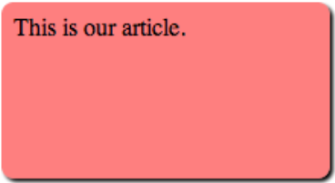
This will be the resulting output when we hover over our element.

As you can see we have rounded corners, a shadow and we have an almost pink background-color. The background-color is set to red, but when we hover over it, we are setting the background-color to be 50% transparent.
To learn more about CSS3.0, check out the CSS3.0 Roadmap.


