You can access the full course here: UI/UX FOR GAME DESIGN
Table of contents
Introduction
In today’s digital age, the emphasis on user-friendly design can not be overstated, which is why UI and UX design is important. Whether it’s a website, mobile application or a video game, an effective interface is crucial for an excellent user experience. One of the key elements in creating such designs involves the Iterative Design process. It is a prototyping strategy commonly employed in UX and UI design, where repeated user testing, problem discovery, and refinement follow each other in a continuous cycle.
This UI and UX design tutorial explains the Iterative Design process, specifically applied to game UI design through the wireframing phase. As a project to accompany this tutorial, you will be able to apply the process to your own wireframes and create a user-friendly game UI.
Project Files
To facilitate easy learning, we’re providing you with a downloadable set of project files and some screenshots used in the tutorial. But remember, the essence to fully understand the UI and UX design process lies in doing it hands-on.
Download Project Files Here
Iterative Design – Part 1
Iterative design is a common process in the UI and UX design workflow. We will be using it as part of our wireframing phase to find any improvements or additions that we can make. Iterative design is the process of testing an interface, making changes based on this testing, and finally repeating the process to refine the product. This is known as a circular process as there isn’t a specific endpoint, instead, you continue repeating the process until you are happy with the result. This can be shown as a flowchart diagram.

Performing the Iterative Design Process
A wireframe doesn’t have any functionality, so this makes it slightly trickier to perform the testing phase. As a solution to this, we are going to simulate a user interacting with our game UI. We are essentially going to pretend we are the user from our user stories and run through different scenarios on our game UI wireframe. This will allow us to identify expected interactions, any issues with the UI and UX design, or other improvements that we may not have caught in the initial wireframing stage, without needing a functional UI to test.
We can also easily update our wireframe, which makes it perfect for the refining stage. It is important to note that performing the interactive design process on a wireframe is still limited, so it is important to perform it on a working UI as well, once that is created.
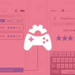
With this in mind, we can perform the iterative UI and UX design process on our wireframe inside of draw io. We know that the player would walk toward the enemy using the left joystick, and turn to face them by dragging on the screen. When next to the enemy they would use the block and attack buttons to fight them. With only a quick glance at the screen, you are likely to notice the joystick first, as it is one of the largest elements. This is good, as the joystick will likely be the most interacted-with element on the screen.
However, with the buttons on the right, it is quite hard to tell what buttons are the most important at a quick glance. Through the testing that we just performed, we know the block and attack buttons are likely to be the most important, especially the attack. With that in mind, we can make the other buttons smaller to make the attack button more visually important.

Here we have completed one cycle of the iterative UI and UX design process:
- Testing – We pretended to be our users and discovered they would likely be moving, looking around, and attacking often.
- Issue – We found that our attack button would likely be the most commonly used, however, it wasn’t visibly any more important.
- Refinement – We scaled the buttons to different sizes, and moved them for a more user-friendly experience.
Performing a Second Iteration
Now, if we continue the scenario of attacking the enemy we may find our player gets damaged. However, on the current UI, there is no health bar, so there is no way for the player to know this. To fix this, we will use a progress bar shape from the Bootstrap category. We can then place this at the top of the screen as our health bar.

We can also place a text element on top of the health bar as a numeric representation of the health.

With the health bar in place, we have completed another cycle of the iterative UI and UX design process:
- Testing – We pretended to be our users and found they would likely take damage while fighting enemies.
- Issue – We found that there was no health representation on the screen, so the user did not know their player character’s health.
- Refinement – We added a large health bar at the top of the screen.
As you can see, even by simulating a test of our game UI, we can make a lot of small improvements to make the user interface more useful to our target demographic. As a challenge, try performing the iterative process once more before the next lesson, to try and find an additional change that can be made to the UI and UX design.
Iterative Design – Part 2
In this part, we will be covering a final example of performing the iterative UI and UX design process on our wireframe. This will be the final improvement to the wireframe, however, like with the challenge set in the previous lesson, feel free to perform the process as many times as you like. It’s important to keep in mind in a real-world application you would probably perform many more iterations, along with interviewing real-world users and performing the iterative design process at more phases, such as on a prototype.
To begin performing our final change, we need to start the cycle from the testing phase again. So like in the previous part, our user would be moving with the joystick, looking around by dragging on the screen, and fighting an enemy with the UI buttons. We also now have a health bar so that the user can keep track of their stats.
However, if the user keeps attacking the enemy, they will likely want to know how much health the enemy has left. To fix this, we can add a smaller health bar above the enemy. We can do this using another progress bar shape and scaling it down to the size that we want.

To get finer control over the size of the health bar, we can use the Size property in the Arrange window, found on the right-hand side of the draw io interface. We will set ours to 20×6 in this example.

The enemy’s health bar should be smaller than the player’s, as it’s possible there will be multiple on the screen and you don’t want the UI to become overcrowded. Additionally, the player’s focus should primarily be on their own health bar, so making it larger will make it appear more important. With the enemy health bar in place, we have completed the final cycle of the iterative UI and UX design process:
- Testing – We pretended to be our users and found they would want to know the health of the enemy they were fighting.
- Issue – We found that there was no enemy health representation on the screen, so the user did not know the enemy’s health.
- Refinement – We added a small health bar above the enemy.
Our UI should now be much more accessible to our target demographic. When you compare our game UI against our research, you will likely now see patterns in how others have designed their UI that you may not have noticed before. This process doesn’t necessarily have to be applied to just game UIs either, it can be applied to anything you are designing.
Conclusion
Being able to create an intuitive and user-friendly interface using the iterative UI and UX design process is an invaluable skill for any game developer. In this tutorial, we’ve explored two cycles of this process, where we’ve tested, identified problems and refined our game UI wireframe.
With the theory and practice, you should be able to apply this process to any UI and UX design project, perfecting the interface with each iteration. Going through a few more iterations would only take you closer to a near-perfect user-oriented design.
If you’d like to learn more about UI and UX design, we recommend the following free video which covers the design methodologies for the overall process!
We hope this tutorial helps you in creating your own intuitive UIs for your digital products or games. Good luck with refining your skills further and happy designing!
Did you come across any errors in this tutorial? Please let us know by completing this form and we’ll look into it! FINAL DAYS: Unlock coding courses in Unity, Godot, Unreal, Python and more.
Transcript – Iterative Design – Part 1
Hey everyone. In this lesson we are going to be looking at iterative design. Now, iterative design is a process that you’ll be doing numerous times throughout the UI and UX design workflow, okay? And in our case, we are going to be implementing it during our wireframe phase in order to improve upon our design, look for issues that may occur, look for additional things we can add, et cetera.
So first of all, what is iterative design? Well, basically this is the process of testing the interface, making changes, then repeating that process to refine the product. The iterative design process is a circular process that doesn’t really have a strict endpoint. Rather you keep repeating the process until you are happy with the results.
This process works as follows: we first of all test our interface. We then gather issues and gather feedback, different improvements we might want to make. Then we refine the interface and we improve it. We make changes, we remove things that need to be removed, and then we test the interface again, identify issues, refine and improve and repeat.
Like I said, this process does not have a strict endpoint. Rather you keep repeating this process until you’re happy with the final product. How much iteration you want to do for your product, depends entirely on you. It really depends on how finely you want to adjust it to your user story, to your target demographic, until you are happy.
Now, how are we gonna be doing this with our wireframe? Our wireframe doesn’t really work, okay? It’s not really doing anything. There’s no game to play. The buttons don’t do anything. The joystick doesn’t do anything. Well for this, we are going to simulate a user interacting with our interface.
We’ll pretend we are a user who wants to do things in our game and interact with our ui. This is going to allow us to identify issues, identify expected interactions, and other potential improvements that we can make. Then what we’re going to do is like the process before said, we are then going to implement these changes and repeat the process, until we are happy with our wireframe.
Now, there’s only so much iteration we can do with a wireframe of course, because we aren’t actually playing a physical game or interacting with tangible UI. But there is still some iterative UI and UX design that we can do during the wireframe phase.
Let’s jump over to our wireframe now and get started. So, we are inside of our wireframe. Let’s pretend we are a user playing the game. So we have our player here, we have an enemy here. We probably want to move towards them. So we can click and drag on the joystick here in the direction that we want to move. We can then click and drag on the screen in order to move that around. And now, we are up to our enemy, they might attack us. So we’ll click on the block button. We then want to go ahead and attack them.
In game design and in UI and UX design as a whole, it’s a good idea that you keep in mind what is going to be the most important information on the screen. The most important information is generally what you want to be most clear to the player. Now, having a quick glance at our screen, one of the first things you notice is probably going to be the joystick, because that stands out as one of the larger elements on our screen here. That’s because you interact with it a lot in the game. It is one of the most interactive UI elements in our setup.
When it comes to these four buttons here, at a quick glance, it’s almost impossible to tell which one is the most important, because they all look equally important. This might mislead a user into thinking that all of these buttons are of equal importance, when in reality, they aren’t. In a game like an action RPG, the most important button is probably going to be the attack button.
So, this is what the player needs to be able to identify as the most important button on the UI. That can be the first step of our iterative UI and UX design process. We’re looking at this, we’re playing the game. But the player might have trouble with clicking on the attack button as it’s the same size as everything else and they might accidentally click on block, they might accidentally click on jump.
So what we need to do is we need to make this attack button more important. So we can end the play test there, we can go back to our UI and UX design and iterate upon it. We’ll make this attack button be the biggest out of these four buttons, so as to draw the most attention towards it.
We can also then decrease the size of these other buttons since they don’t really need to be this large. After resizing, we’ll have the smaller buttons circulate the attack button. Now at a quick glance, you see, the attack button here, that’s the most important. And then we have all of these sort of accessory abilities or actions to the attack.
However, now that we’ve identified this issue and have decided to implement changes to prioritize the attack button, we’ve already made a pretty major improvement to improve the layout of our UI.
Another thing to pay attention while iterating this design is that in order for the player to progress and win the game, they generally need to attack things. That is generally done by attacking things, so the attack button is going to be the most important button out of these four.
This priority can be set by making the button larger and maybe making it a separate color so it stands out more. A color that stands out can also draw the players’ attention to the most important button on the screen.
Now, let’s simulate another game. We’ll move the player around, we’ll approach the enemy, we’ll easily be able to click on the attack button now that it’s larger than everything else. We’ll block and we might even cast a special or jump to get out of the way. We’ll then attack them again. The enemy then attacks us and we get damaged. Now, that is some information that we don’t really have access to because typically in a game, you are going to have a UI element that represents your health bar or represents how much ability power or charge you have.
And that’s important because that is information the player needs to know as this influences their decisions going forward. If the player’s low on health, they’re probably not going to chase after an enemy, whereas if they’re in full health, they’re probably going to be more confident in doing so. So in our situation here, we need to figure out what information we want to provide to the player.
For example, we don’t need to provide the player with how fast they’re moving or what direction they’re moving in. There’s a lot of information we could show the player, but a lot of it is also pretty unnecessary. In our case, a health bar would be important as that is something that the player would generally like to know. So once we’ve found a scroll bar or a progress bar, we can then add in some text because we also want to probably tell the player how much help they have.
Making this information bold and changing the color so it stands out a bit can be helpful. This way your UI becomes much more informative, and this is thanks to our iterative improvements upon it by just basically simply simulating a test. Now between now and the next lesson, I want you to go ahead and do the iterative process one more time and figure out something else that might need to be added, changed, removed, or moved around with your UI.
Now if this is not the sort of UI you’re working with, then of course iterate upon it on your own. If you’re making a puzzle game, if you’re making a platformer, do that. Between now and next lesson, figure out a different improvement or refine a certain aspect of the UI and then we can continue on with our dUI and UX design process.
So thanks for watching and I’ll see you all then in the next lesson.
Transcript – Iterative Design – Part 2
Welcome back everyone. In this lesson, we are gonna finish off our iterative design process by adding in our final improvement. Okay? But if this was a real case scenario where you’re actually developing a UI, you’d probably iterate upon the UI and UX design many, many times. You’d probably show people it, compare it to your research, get advice from your user story focused users, your target demographic in order to see what they think of it.
And yeah, you do a lot more sort of background research and development on the UI, but you know, we’re sort of streamlining through the process right here. So we’re just going to go nice and easy on it.
So I hope that you went ahead and done the iterative design process on your wireframe once more to figure out an additional thing to add or remove or modify. So let’s go ahead and do it right now for our game. So like before, we can move around with the joystick. We can block, we can do our special ability, we can jump, we can attack with the attack button right here. Okay?
So we’ll swing at our enemy. They might then swing back at us. Our health will then be reduced over here on this screen. We can open up our inventory to change our items or equip new things. We can pause the game if we want to have a break, or save.
But what happens if we keep attacking the enemy? That is also information that we need to know such as the enemy’s health, okay? Cause typically in an RPG game like this, the enemy will have their own health bar on screen.
Now what we need to do for that is we need to basically add in another health bar similar to the one here. Although we don’t want it to be the same size, we don’t want it to be the same layout. Okay? So what I’m gonna do is I’m gonna go down here and I’m gonna find another, scroll bar, or not a scroll bar, a progress bar like we had before. I’m gonna drag that in. We are then going to resize it. So I’m just gonna bring this down here, resize it so it’s a lot smaller than what we have right now. Okay?
Then gonna shrink it down vertically as well to be nice and small here. Something like that, I reckon. And then we’re just gonna move it above the enemy’s head. We can also then use the arrow keys to have much more finer control over its placement.
And if you want to have a finer control over its size, we can go over to the window here on the right-hand side and where it says size, we can then click on these little things here to adjust the size. Okay? So you can see I’m having a lot finer control over how big this UI element is. Okay? So there we go.
So we can then adjust this position just above the enemy’s head, like so. Now, as general advice in UI and UX design and game design, it is good to have the enemy’s health bar be smaller than the player’s, the reason why is because that information could be crowded if there are multiple enemies on screen. You probably don’t want dozens of these large scale health bars all over the screen. And second of all, because you want to be able to differentiate the two. The one that’s more important to the player would generally be their own health bar.
As that being the larger element that is gonna be where their eyes are gonna dart to first. And that’s also what the player’s gonna see a lot easier on screen if there’s a lot of action going on. Whereas with the enemy health bar, this is probably gonna only appear briefly on screen and it’s gonna act as just an indicator for how far the enemy is to be defeated, okay?
So having that as a much smaller element is gonna be important, as you don’t want these large health bars popping up all over the place. So from here you can of course go ahead with the iterative design process once more, twice more, three times more. But I think for now we’re pretty happy with what we have right here on our wireframe. And I think it is quite an improvement of what we had originally.
If you compare it to what we had before, all these four buttons were the exact same size and it wasn’t clear which was the most important or most well used, whereas now we know that the attack button is probably gonna be the one that is used the most with all these sort of accessory abilities on the outside. And if you compare this to much of the research, you’ll see that that is also the case. Many games have their most important buttons or most commonly used, most well-used buttons be the larger ones.
That is typically what the player is gonna click on most. And you probably on a touchscreen like this, you don’t want the player mis-clicking accidentally. So having the buttons that the players are gonna use most often be the largest ones is gonna be a good idea.
And this can be the case for not just game design and game UIs, but for any sort of UIs out there. If you are creating an app, for anything really, having the most important information be the largest, having the most important interactions be the largest and most clear to the user is always going to be an important step in designing a good UI.
So yeah, that is a look at creating a wireframe and iterating upon it. So thanks for watching and I’ll see you all then in the next lesson.
Interested in continuing? Check out our all-access plan which includes 250+ courses, guided curriculums, new courses monthly, access to expert course mentors, and more!