When I first started learning Bootstrap, I thought it was too plain and just no fun to use. Then after some time using Bootstrap, I found it very useful, and much easier to design for mobile. Bootstrap is a framework for HTML, CSS, and JavaScript for developing responsive, mobile-first projects on the web. Not only is it a vital tool that can help you professionally, you can also build amazing projects fit for any portfolio. This is not to mention it works great with other frameworks like Babylon.js!
Table of contents
Download source code
You can download this tutorial’s source code here.
Did you come across any errors in this tutorial? Please let us know by completing this form and we’ll look into it!

FINAL DAYS: Unlock coding courses in Unity, Godot, Unreal, Python and more.
Introduction
The template for a Bootstrap website starts like this:
<!DOCTYPE html>
<html lang="en">
  <head>
    <meta charset="utf-8" />
    <meta http-equiv="X-UA-Compatible" content="IE=edge" />
    <meta name="viewport" content="width=device-width, initial-scale=1" />
    <!-- Latest compiled and minified CSS -->
    <link rel="stylesheet" href="https://maxcdn.bootstrapcdn.com/bootstrap/3.3.5/css/bootstrap.min.css" />
    <!-- Optional theme -->
    <link rel="stylesheet" href="https://maxcdn.bootstrapcdn.com/bootstrap/3.3.5/css/bootstrap-theme.min.css" />
    <title>Aromatherapy Health</title>
    <link href="css/styles.css" />
  </head>
  <body>
    <div class="container-fluid">

    </div>
    <!-- jQuery (necessary for Bootstrap's JavaScript plugins) -->
    <script src="https://ajax.googleapis.com/ajax/libs/jquery/1.11.3/jquery.min.js"></script>
    <!-- Latest compiled and minified JavaScript -->
    <script src="https://maxcdn.bootstrapcdn.com/bootstrap/3.3.5/js/bootstrap.min.js"></script>
  </body>
</html>
To implement Bootstrap in our website, we use the Bootstrap CDN for CSS and JavaScript. You can choose to use the CDN’s or you can choose to download the complete Bootstrap framework. The “3.3.5” is the version of Bootstrap. As time goes by, the version gets updated, so ensure that your website is up-to-date with the current version of Bootstrap.
Let’s get on with it. In this part, I will introduce to you the Navbar, the Jumbotron, Glyphicons, the Grid System, and the Carousel.
To fluid or not to fluid
Looking back at the above template, there is a div with a class container-fluid. You got two class options, .container if you want a fixed width or .container-fluid if you want a full width.
Jumbotron
The jumbotron is one of Bootstrap’s lightweight and flexible component. A simple jumbotron looks like this.
<div class="jumbotron">
  <h1>Aromatherapy Health</h1>
  <p>The most popular and fastest-growing branch of complementary medicine in the world.  Aromatherapy involves the use of essential oils - precious, sweet-smelling liquids extracted from many varieties of plants.</p>
</div>
A jumbotron is created using a div with a classname jumbotron.
You can give the jumbotron some color and/or image as well, using the jumbotron class.
.jumbotron {
	background: #ABCDEF url('images/230px-Aromatas.JPG') no-repeat right top;
}

Nav and Navbar
Navs have their shared markup, starting with the base .nav class. Let’s have a look at this very simple nav:
<ul class="nav nav-tabs">
  <li role="presentation" class="active"><a href="#">Home</a></li>
  <li role="presentation"><a href="#products">Products</a></li>
  <li role="presentation"><a href="#contact">Contact us</a></li>
</ul>
You can replace the .nav-tabs with .nav-pills. You can stack pills vertically with .nav-stacked. You can also make them justified with .nav-justified.
Navbars, on the other hand, are responsive meta components that serve as navigation headers for your website, as shown in Figure 2. They begin collapsed in mobile views and become horizontal as the available viewport width increases, as shown in Figure 3.
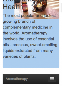

The following code is a rather lengthier version from the previous .nav we just used.
<nav class="navbar navbar-inverse navbar-static-top">
  <div class="navbar-header">
    <button type="button" class="navbar-toggle collapsed" data-toggle="collapse" data-target="#navbar" aria-expanded="false" aria-controls="navbar">
      <span class="sr-only">Toggle navigation</span>
      <span class="icon-bar"></span>
      <span class="icon-bar"></span>
      <span class="icon-bar"></span>
    </button>
    <a class="navbar-brand" href="#">Aromatherapy</a>
  </div>
  <div id="navbar" class="navbar-collapse collapse">
    <ul class="nav navbar-nav">
      <li class="active"><a href="#">Home</a></li>
      <li><a href="#">Essential oils</a></li>
      <li><a href="#holistic">Holistic health</a></li>
      <li class="dropdown">
        <a href="#diets" class="dropdown-toggle" data-toggle="dropdown" role="button" aria-haspopup="true" aria-expanded="false">Diet plans<span class="caret"></span></a>
        <ul class="dropdown-menu">
          <li><a href="#">The Vegetarian Diet</a></li>
          <li><a href="#">The Low-Fat Diet</a></li>
          <li><a href="#">The Bikini Diet</a></li>
          <li role="separator" class="divider"></li>
          <li><a href="#">Menu Plans</a></li>
        </ul>
      </li>
    </ul>
  </div>
</nav>
We gave this navbar an inverted look .navbar-inverse. The .navbar-default gives the navbar a plain white background look, with .navbar-inverse, you give your navbar a darker look. However, if you don’t want the light or the dark navbar look, you can always style to the color you want, but this also will affect the burger menu.
The button has a class of collapsed, this is only viewed when the device is a phone. The three span with class icon-bar gives the button three lines, which is now frequently termed the “burger menu”. Although, you are a not limited to three icon-bar’s.
You can change the navbar to the style you want by styling the .navbar, .navbar-toggle, and .icon-bar. Of course, the first thing to do is remove the .navbar-default or .navbar-inverse.
.navbar {
    background-color: #ABF;
}
.navbar .active {
    background-color: #ADF;
}
.navbar-toggle {
    background-color: #999;
}
.icon-bar {
    background-color: blue;
}
You can add .navbar-static-top to ensure the alignment you want for your navbar. This creates a full-width navbar that scrolls away with the page. Your navbar can also be aligned to the left, .navbar-left, or to the right, .navbar-right, or it can be fixed to the top, .navbar-fixed-top, or to the bottom, .navbar-fixed-bottom.
The .navbar-brand is where you are able to brand the navbar with your company name or blog/website name. You will notice that the .navbar-brand is a part of the .navbar-header, therefore, the brand name will still appear when it’s viewed on a mobile device. The div with a class .navbar-collapse and .collapse ensures a responsive navbar. The first list class is set to active to show the user which page of the website they are viewing currently.
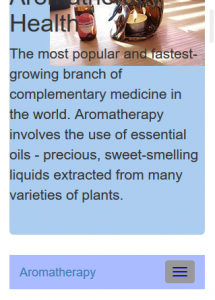
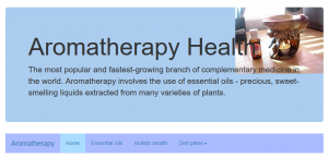
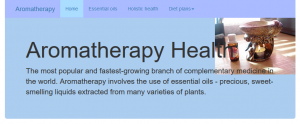
Finally, before I end of navbars and move on the next section of this tutorial, I want to style one more thing to the navbar. You can choose to leave your navbar in the position it currently is, at the top. Or if you want to have it placed within the jumbotron, for neatness, or your preference, we wrap the whole nav into a .navbar-wrapper, and style the necessary.
<div class="navbar-wrapper">
  <div class="container">
    <nav class="navbar navbar-inverse navbar-static-top">
	. . .
    </nav>
  </div>
</div>
The good thing about Bootstrap, is that they allow us to customize and adapt their example templates. This styles was taken from Bootstrap’s Carousel example.
/* Special class on .container surrounding .navbar, used for positioning it into place. */
.navbar-wrapper {
	position: absolute;
	top: 0;
	right: 0;
	left: 0;
	z-index: 20;
}
/* Flip around the padding for proper display in narrow viewports */
.navbar-wrapper > .container {
	padding-right: 0;
	padding-left: 0;
}
.navbar-wrapper .navbar {
	padding-right: 15px;
	padding-left: 15px;
}
.navbar-wrapper .navbar .container {
	width: auto;
}
Glyphicons
Glyphicons is a library of icons and symbols, and they are fun to use. To demonstrate its use, we will add glyphicons to our navbar menu items. There are over 250 glyphicons that you can use to suit your requirements. For more information about glyphicons, visit http://getbootstrap.com/components.
For performance reasons, icons are best used with another element, and allow for spacing between the icon and the text.

<div id="navbar" class="navbar-collapse collapse">
  <ul class="nav navbar-nav">
    <li class="active"><a href="#" aria-label="Home"><span class="glyphicon glyphicon-home" aria-hidden="true"></span> Home</a></li>
    <li><a href="#" aria-label="Tree deciduous"><span class="glyphicon glyphicon-tree-deciduous" aria-hidden="true"></span> Essential oils</a></li>
    <li><a href="#holistic" arial-label="Grain"><span class="glyphicon glyphicon-grain" aria-hidden="true"></span> Holistic health</a></li>
    <li class="dropdown">
      <a href="#diets" class="dropdown-toggle" data-toggle="dropdown" role="button" aria-haspopup="true" aria-expanded="false" aria-label="Heart"><span class="glyphicon glyphicon-heart" aria-hidden="true"></span> Diet plans<span class="caret"></span></a>
      <ul class="dropdown-menu">
        <li><a href="#">The Vegetarian Diet</a></li>
	 <li><a href="#">The Low-Fat Diet</a></li>
	 <li><a href="#">The Bikini Diet</a></li>
	 <li role="separator" class="divider"></li>
	 <li><a href="#">Menu Plans</a></li>
      </ul>
    </li>
  </ul>
</div>
You can see in the code, the <span> with the class of glyphicon and glyphicon-*. We use a span because icon classes cannot be directly combined with other components.
For the benefit of assistive technologies we can add an aria-label attribute on the controls, like this.
<ul class="nav navbar-nav">
  <li class="active"><a href="#" aria-label="Home"><span class="glyphicon glyphicon-home" aria-hidden="true"></span> Home</a></li>
  <li><a href="#" aria-label="Tree deciduous"><span class="glyphicon glyphicon-tree-deciduous" aria-hidden="true"></span> Essential oils</a></li>
  <li><a href="#holistic" arial-label="Grain"><span class="glyphicon glyphicon-grain" aria-hidden="true"></span> Holistic health</a></li>
</ul>
Carousel
The carousel is like an image gallery slider, but, you don’t have to use it for images only. It’s a slideshow for cycling through elements, so, you can have text, and/or images in them.
<div id="myCarousel" class="carousel slide" data-ride="carousel">
  <!-- Indicators -->
  <ol class="carousel-indicators">
    <li data-target="#myCarousel" data-slide-to="0" class="active"></li>
    <li data-target="#myCarousel" data-slide-to="1"></li>
    <li data-target="#myCarousel" data-slide-to="2"></li>
    <li data-target="#myCarousel" data-slide-to="3"></li>
  </ol>
  <div class="carousel-inner" role="listbox">
    <div class="item active">
      <img class="first-slide" src="images/Tranoljelampa.JPG" alt="Storing essential oils" />
      <div class="container">
        <div class="carousel-caption">
          <h1>How to Store your Essential Oils</h1>
          <p>The chemicals found in essential oils range from safe alcohols to esters, aldehydes and substances like phenols, which are more toxic, but safe when used correctly.  When you use your oils you dilute them for external application, but you must first ensure that they are stored properly.  If you don't, chemical changes may occur that mean they may be unsafe for use.</p>
          <a class="btn btn-lg btn-primary" href="#" role="button">Read more</a>
        </div>
      </div>
    </div>
    <div class="item">
      <img class="second-slide" src="images/670px-Wash-Your-Hands-Step-1.jpg" alt="Wash your hands" />
      <div class="container">
        <div class="carousel-caption">
          <h1>Preserving your Products</h1>
          <p>Essential oils are natural preservatives, so when added to creams or bath oils they slow down bacterial spoilage.  But the dilution ratios at which they are used are so small that there are insufficient amounts in a product to make it sterile.  Therefore, the same standards of hygiene used for food preparation should be observed.</p>
          <a class="btn btn-lg btn-primary" href="#" role="button">Read more</a>
        </div>
      </div>
    </div>
    <div class="item">
      <img class="third-slide" src="images/670px-Buy-Essential-Oils-Step-2.jpg" alt="Correct handling of oils" />
      <div class="container">
        <div class="carousel-caption">
          <h1>Correct Handling of Oils</h1>
          <p>The individual chemical constituents of essential oils may be extracted or manufactured synthetically for a variety of chemical purposes, including solvents and powerful disinfectants.  This gives you an example of how potent they are.  Safety standards for essential oils give the range of oils and their constitutents, which are safe for blending and external use in aromatherapy.  Even though these oils may be judged safe, caution must be observed when handling them, especially in their raw, undiluted state.</p>
          <a class="btn btn-lg btn-primary" href="#" role="button">Read more</a>
        </div>
      </div>
    </div>
    <div class="item">
      <img class="fourth-slide" src="images/Sunflower_oil_and_sunflower.jpg" alt="Using Oils Responsibly" />
      <div class="container">
        <div class="carousel-caption">
          <h1>Using Oils Responsibly</h1>
            <p>For responsible practice, always observe these general safey guidelines for yourself and those people you treat.</p>
            <a class="btn btn-lg btn-primary" href="#" role="button">Read more</a>
          </div>
        </div>
      </div>
    </div>
    <a class="left carousel-control" href="#myCarousel" role="button" data-slide="prev">
      <span class="glyphicon glyphicon-chevron-left" aria-hidden="true"></span>
      <span class="sr-only">Previous</span>
    </a>
    <a class="right carousel-control" href="#myCarousel" role="button" data-slide="next">
      <span class="glyphicon glyphicon-chevron-right" aria-hidden="true"></span>
      <span class="sr-only">Next</span>
    </a>
  </div>
The id is the name of your carousel that is required as it is also referred to in the list as a data-target. That id name can be any name you find suitable. If you are wondering what is data-target, it is basically a data attribute called target, that carousel.js uses in its JavaScript code to target that id. To know more about data attributes, there is a nice tutorial here.
The .carousel is specifying that this div contains a carousel; while the .slide adds a CSS transition and animated effect when the item is slide across the screen. You can choose to keep the .slide or not. The .carousel-indicators are the little dots at the bottom of the carousel. This indicates how many slides there is in the carousel as well as which slide the user is currently viewing. Within the .carousel-inner div, all the content for each slide is specified. The content of each slide is defined in the .item class, which can include text or images.
The left and right controls defined in the last 8 lines above allows the user to go back and forth between the slides manually.
A bit of CSS to cater for positioning of the image as well as height of the carousel.
.carousel {
  height: 500px;
  margin-bottom: 60px;
}
/* Since positioning the image, we need to help out the caption */
.carousel-caption {
  z-index: 10;
  color: #333;
  text-shadow: 2px 2px 5px crimson;
}
/* Declare heights because of positioning of img element */
.carousel .item {
  height: 500px;
  background-color: #FFF;
}
.carousel-inner > .item > img {
  position: absolute;
  top: 0;
  left: 0;
  min-width: 100%;
  height: 500px;
  opacity: 0.4;
}
The Grid system
The Grid system is first thing one learns when they learning Bootstrap. It is a mobile-first fluid grid system that appropriately scales up to 12 columns. Your rows must be placed within a .container (for fixed-width) or .container-fluid (for full-width), this allows for proper alignment and padding. There are four screen sizes: -xs- for extra small; -sm- for small; -md- for medium; and -lg- for large screen sizes.
Extra small devices are phones with screen width smaller than 768px; Small devices are tablets with a screen width of 768px and up; medium devices are desktops with a screen width of 992px and up; and large devices are large desktops with a screen width of 1200px and up.
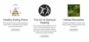
<div class="container-fluid marketing">
<!-- Three columns of text below the carousel -->
<div class="row">
<div class="col-md-4 col-lg-4">
<img class="img-circle" src="images/Harvard_healthy_eating_pyramid.jpg" alt="Healthy Eating" width="140" height="140" />
<h2>Healthy Eating Plans</h2>
<p>Ensuring that you eat correctly by following a proper diet is a responsible way of keeping your body healthy and fit.</p>
<p><a class="btn btn-default" href="#">View details»</a></p>
</div>
<div class="col-md-4 col-lg-4">
<img class="img-circle" src="images/250px-Yang_cheng_fu_single_whip_application_2_75.jpg" alt="Spiritual Healing" width="140" height="140" />
<h2>The Art of Spiritual Healing</h2>
<p>With a variety of healing methods such as Tai Chi, Fen Shui and Taoism, you can choose any of these methods to improve your health of your body with slow-moving exercises and proper breathing.</p>
<p><a class="btn btn-default" href="#">View details»</a></p>
</div>
<div class="col-md-4 col-lg-4">
<img class="img=circle" src="images/220px-Taraxacum_plant.jpg" alt="Herbal Remedies" width="140" height="140" />
<h2>Herbal Remedies</h2>
<p>Remedies for symptoms of Stress, weak immune systems, certain illnesses can be found here.</p>
<p><a class="btn btn-default" href="#">View details»</a></p>
</div>
</div>
<!-- START THE FEATURETTES -->
<hr class="featurette-divider" />
<div class="row featurette">
<div class="col-md-7">
<h2 class="featurette-heading">Choosing your <span class="text-muted"> Carrier Oil</span></h2>
<p class="lead">Grapeseed and sweet almond oil are the best general-purpose carrier oils, and to begin with you will only need one or the other. In this oil-by-oil guide find our about the pros and cons of these and other carrier oils.</p>
<a class="btn btn-lg btn-primary" href="#" role="button">Read more</a>
</div>
<div class="col-md-5">
<img class="featurette-image img-responsive center-block" src="images/145px-Olive_oil_from_Oneglia.jpg" alt="Carrier Oils" />
</div>
</div>
<hr class="featurette-divider" />
<div class="row featurette">
<div class="col-md-7 col-md-push-5">
<h2 class="featurette-heading">Aromatherapy <span class="text-muted">and massage precautions</span></h2>
<p class="lead">There are lots of advantages to using essential oils, especially for massage but there are conditions when home use of aromatherapy and meassage is best avoided.</p>
<a class="btn btn-lg btn-primary" href="#" role="button">Read more</a>
</div>
<div class="col-md-5 col-md-pull-7">
<img class="featurette-image img-responsive center-block" src="images/AromatherapyMassage2.jpg" alt="Aromatherapy precautions" />
</div>
</div>
<hr class="featurette-divider" />
<div class="row featurette">
<div class="col-md-7">
<h2 class="featurette-heading">Wonders of the world<span class="text-muted"> Part 1</span></h2>
<p class="lead">Secreted inside seeds, petals and even honeycombs, some of the ingredients used in aromatherapy come from far afield. Here we tell you how you can use them to give yourself a healthier body.</p>
<a class="btn btn-lg btn-primary" href="#" role="button">Read more</a>
</div>
<div class="col-md-5">
<img class="featurette-image img-responsive center-block" src="images/220px-Aloe_Vera.jpg" alt="Aloe vera" />
</div>
</div>
<hr class="featurette-divider">
<div class="row featurette">
<div class="col-md-7 col-md-push-5">
<h2 class="featurette-heading">Wonders of the world <span class="text-muted">Part 2</span></h2>
<p class="lead">Found inside eggs, fruit, clay and honey, many of the ingredients used in aromatherapy come from natural sources. Discover how to use them in health and beauty treatments.</p>
<a class="btn btn-lg btn-primary" href="#" role="button">Read more</a>
</div>
<div class="col-md-5 col-md-pull-7">
<img class="featurette-image img-responsive center-block" src="images/120px-Oenothera_macrocarpa_a1.JPG " alt="Evening Primose plant" />
</div>
</div>
<hr class="featurette-divider" />
<div class="row featurette">
<div class="col-md-7">
<h2 class="featurette-heading">Wonders of the world <span class="text-muted">Part 3</span></h2>
<p class="lead">From goat's milk to rice flour, many substances used in aromatherapy come from natural sources. Discover how to use them here.</p>
<a class="btn btn-lg btn-primary" href="#" role="button">Read more</a>
</div>
<div class="col-md-5">
<img class="featurette-image img-responsive center-block" src="images/200px-Jojoba.jpg" alt="Jojoba plant" />
</div>
</div>
<hr class="featurette-divider" />
<div class="row featurette">
<div class="col-md-7 col-md-push-5">
<h2 class="featurette-heading">Tools of <span class="text-muted">the trade</span></h2>
<p class="lead">Vaporizing essential oils in your immediate environment is a remarkably effective way to reap the benefits of aromatherapy. But which method is best for you?</p>
<a class="btn btn-lg btn-primary" href="#" role="button">Read more</a>
</div>
<div class="col-md-5 col-md-pull-7">
<img class="featurette-image img-responsive center-block" src="images/Collection_of_modern_synthetic_candles.JPG " alt="Aromatherapy candles" />
</div>
</div>
<hr class="featurette-divider" />
If you apply any .col-md-* class to an element, you are not only affecting its styling on medium devices but also on larger devices if a .col-lg-* class is not present. Media queries in the LESS files are used to create the key breakpoints in the grid system. Each row much be equal to 12 columns, if its more than 12 columns, those columns will wrap onto a new line.
/* Center align the text within the three columns below the carousel */
.marketing .col-lg-4 {
  margin-bottom: 20px;
  text-align: center;
}
.marketing h2 {
  font-weight: normal;
}
.marketing .col-lg-4 p {
  margin-right: 10px;
  margin-left: 10px;
}

/** FEATURETTES */
.featurette-divider {
  margin: 80px 0;		/* Space out the Bootstrap <hr /> more */
}
/* Thin out the marketing headings */
.featurette-heading {
  font-weight: 300;
  line-height: 1;
  letter-spacing: -1px;
}
In our example, we used the Stacked-to-Horizontal grid system, which displays as horizontal on desktop and stacked on mobile and tablet devices.
In this introduction to Bootstrap, you were introduced on some of its basic features. Creating a Jumbotron, styling a navigational menu, attaching some glyphicons, seeing how useful a grid system can be and creating a slideshow using Carousel.js. Bootstrap is useful for developing for mobile devices.
Hope this tutorial was helpful in getting to grips with its complexities. What type of website would you be building with Bootstrap? Do you have any questions about styling with Bootstrap? Feel free to leave comments.


